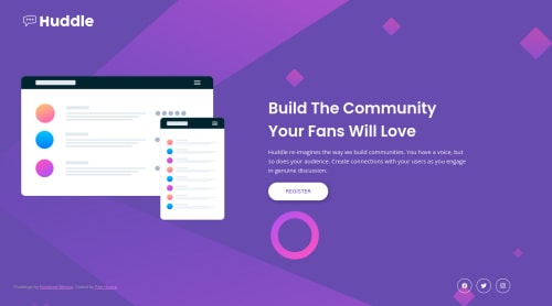
Not Found
Not Found
Not Found
Not Found
Not Found
Not Found
Not Found
Not Found
Not Found
Not Found
Not Found
Not Found
Not Found
Not Found
Not Found
Not Found
Not Found
Not Found
Not Found
Not Found

Submitted

Huddle Landing Page - SCSS

Pon Huang 210

@ponhuang


Design comparison


SolutionDesign

Solution retrospective


Deeply appreciate any feedback or suggestion to improve responsive design or else in my solution. :)

I used Google Chrome to inspect the mobile version, it seems ok. However, in the real mobile device, the social link doesn't have space below, how will you manage it? Adding padding-bottom?

Community feedback

@Ahmed96Mah

Posted

Hello Pon,

How are you?. Hope your are doing well :)

I checked your design on my mobile and it looks fine. I think there will always be a space between the social icons' div and the attribution paragraph, as you have set the gap between the two elements to 3rem (in your file _layout.scss on line 146). If you mean that, you want to have space below the div with class 'attribution', then you could use margin-bottom to set the space that you want.

However there are points that I have noticed:

1- If you try to rotate the page on mobile, you will find that the footer is placed on top of the main. The reason for that, is the height you have provided for main's section with class 'section-hero', as you have set that section to have a height of 60vh (in your file _layout.scss on line 16). However, a height of 60vh for a rotated mobile screen isn't enough for the section to display its content correctly (which makes the section's content spill out of its container).

So, you can change that property as follows, and it will have the same effect (but solve the footer's position issue):

/* change the property of height (on line 16) to min-height */
min-height: 60vh;  
// This will ensure that your section has a minimum height of 60vh
// But also allows that section to expand for any narrow device (like a mobile)

2- Always avoid setting an element's width to 100vw (in your file _layout.scss on line 147), and then giving it a right & left padding or margin (as you did in the same file on line 69). Because this will always results in a horizontal overflow (unless you contained the element's width). And It is also, better to use 100% (instead of 100vw) when you want to set an element's width to full-screen width. Because even the browser's vertical scroll bar (which appears by default on some browsers) is considered as part of the screen's width, and will result in an unwanted horizontal scroll bar to appear (if you choose to use 100vw to set an element's width instead of 100%). So, you could do the following:

/* This is the easiest solution that you could follow */
// change the footer's width property to max-width instead of using width on line 147
max-width: 100vw;  
// this will maintain the padding you have set for the footer, but will decrease the footer's width, so that the footer with (all the padding and margin) would still have a max of 100vw.
// However, keep is mind that if a mobile or a tablet has the vertical scroll bar enabled, this will make a horizontal scroll bar appear at the bottom of the screen (so it is better to use max-width: 100%).

3- To make the hero image centered correctly, you could set the image width to 100% instead of 90% (line 23). And if you want the image to be bigger, you could increase the container's width limit from 90% to maybe a 95% (on line 21) as follows:

.hero {
  &__img {
    width: Min(95%, 60rem);  // limit changed to 95%
    img {
      width: 100%;  // changed to 100%
    }
  }
 .... 
}

Also, notice that there is a very tiny overflow because of the (right & left) padding that you have set for 'hero__info' div (it is barely visible though) like a centimeter :)

Hope this helps.

Take care, and have a nice day :)

By the way, don't forget to generate a new screenshot of your solution after you update it through the update solution section. So that you are able to see your updated design.

Marked as helpful

1

Pon Huang 210

@ponhuang

Posted

@Ahmed96Mah

Hello, Ahmed :)

I'm ok, currently is struggling with email validation in js, cannot fix the problems and finish the challenges. 🥲

I really appreciate every comment you wrote, and point out the things I didn't know or notice, such as rotating version on mobile. Every time I learned things from your comment. Thank you so much~

And I didn't know the update solution screenshot XD Definitely should do this! Thanks

Have a nice day :D

0
faizan 2,420

@afaiz-space

Posted

Hey @ponhuang, congratulation on completing the challenges. many issues in your project. mockup image set in the body as a background. create borders in icons.

0

Please log in to post a comment

Log in with GitHub
Discord logo

Join our Discord community

Join thousands of Frontend Mentor community members taking the challenges, sharing resources, helping each other, and chatting about all things front-end!

Join our Discord