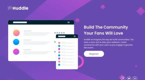
Huddle landing page responsiva com grid e flex

Solution retrospective
PT
Eu acho que a parte do mobile ficou boa
EN
I think the mobile part was good
What challenges did you encounter, and how did you overcome them?PT
Demorou muito para fazer a parte do CSS
EN
It took a long time to do the CSS part
What specific areas of your project would you like help with?PT
Eu gostaria de feedbacks de como melhorar o css deste projeto, mais expecificamente na parte de @media(min-width: 1024px), que eu acho que não ficou tão boa.
Também aceito feedbacks sobre qualquer outro ponto que possa ser melhorado.
EN
I would like feedback on how to improve the css of this project, more specifically in the @media(min-width: 1024px) part, which I think is not so good.
I also accept feedback on any other points that can be improved.
Please log in to post a comment
Log in with GitHubCommunity feedback
No feedback yet. Be the first to give feedback on Isabela Fernanda's solution.
Join our Discord community
Join thousands of Frontend Mentor community members taking the challenges, sharing resources, helping each other, and chatting about all things front-end!
Join our Discord