


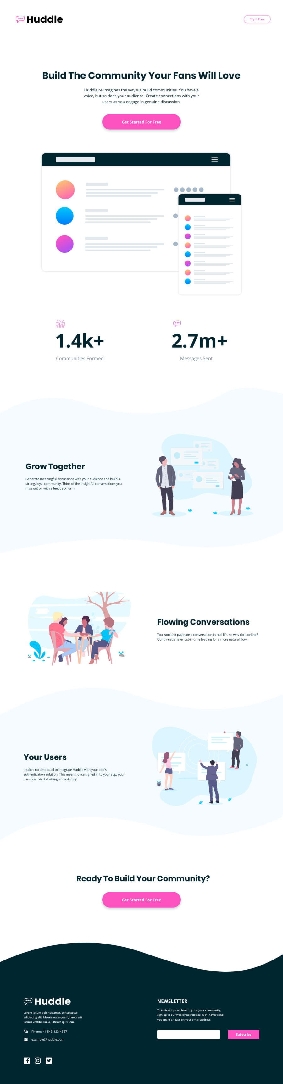
Design comparison
Solution retrospective
Hello, this was quite a challenge for me.
Page acts good on iphone and ipad, but I am not sure about responsivity on other devices. I also didn´t know how to add backgrounds and img to the footer.
Could please look into my code and give me some advices? I would really appreciate it!
Thanks a lot!
Community feedback
- @LooceePosted about 2 years ago
Hi Steve, great job you have done in trying to replicate the website, but you were only able to replicate the mobile design here. Have you tried building desktop first and then making changes for the mobile state? I think you should try that. Here are a few things you can add to your code to achieve the desktop layout:
- Visit (https://www.educative.io/answers/how-to-create-columns-in-html) to help you add columns in your row div.
- For the background, here are some examples to help you add the background: HTML
</div><div class="container-fluid"> <div class="row bg-row top-desktop1"> <-- This is the div for the background --><div class="row blue-row"> <div class="col-md-6 col-sm-12 mobile center"> <img class="human-icons" src="images/illustration-grow-together.svg"alt="Grow together illustration">
      </div>

      <div class="col-md-6 col-sm-12 center">

        <div class="grow-together">

          <h3 class="margin1">Grow Together</h3>

          <p class="margin1">Generate meaningful discussions with your audience and build a strong, loyal community.
          Think of the insightful conversations you miss out on with a feedback form.</p>

        </div>

      </div>

      <div class="col-md-6 col-sm-12 desktop center">

        <img class="human-icons" src="images/illustration-grow-together.svg" alt="Grow together illustration">

      </div>

    </div>

    <div class="row bg-row bottom-desktop1">

    </div>

  </div>

</section>
CSS
.top-desktop1{
background-image: url(images/bg-section-top-desktop-1.svg);
background-position: center; /* Center the image */
background-repeat: no-repeat; /* Do not repeat the image */
background-size: cover; /* Resize the background image to cover the entire container */
}
You'll need a div in your row div to add the background image. To understand more on how it works, visit (https://www.w3schools.com/cssref/pr_background-image.asp).
I hope this helps and I'll be glad to give more explanation if you still need any. Happy coding :)
Marked as helpful0

Please log in to post a comment
Log in with GitHub
Join our Discord community
Join thousands of Frontend Mentor community members taking the challenges, sharing resources, helping each other, and chatting about all things front-end!
Join our Discord