


Design comparison
Solution retrospective
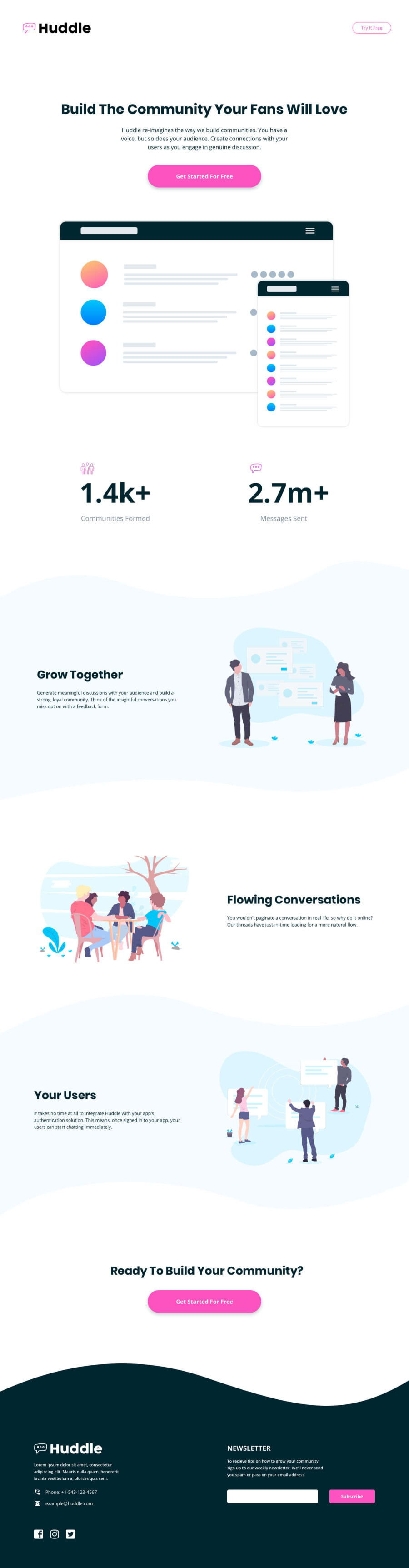
Responsive Design Skills: I’m proud of how well the layout adapts to different screen sizes, ensuring a seamless user experience on mobile and desktop devices.
Visual Appeal and Branding: The color scheme, typography, and use of curved sections showcase attention to detail and create a professional, modern look.
Clean and Semantic Code: The use of semantic HTML elements not only improves accessibility but also demonstrates good coding practices.
Consistency Across Sections: The design maintains a cohesive style, which is critical for user engagement and brand identity.
What I Would Do Differently Next Time: Improve Accessibility: Add more descriptive alt attributes for images, test color contrasts, and ensure all interactive elements (e.g., buttons) are accessible via keyboard and screen readers.
Optimize Performance: Next time, I would:
Optimize images for faster loading. Use lazy loading for images to improve performance on mobile devices. Minify CSS for quicker page rendering. Add Interactivity: Introduce JavaScript to enhance the user experience:
Validate the newsletter input field. Add smooth scrolling to sections when clicking on buttons or navigation links. Experiment with Animations: Adding subtle animations for buttons, image transitions, or section loading could make the page more engaging and dynamic.
Community feedback
Please log in to post a comment
Log in with GitHub
Join our Discord community
Join thousands of Frontend Mentor community members taking the challenges, sharing resources, helping each other, and chatting about all things front-end!
Join our Discord