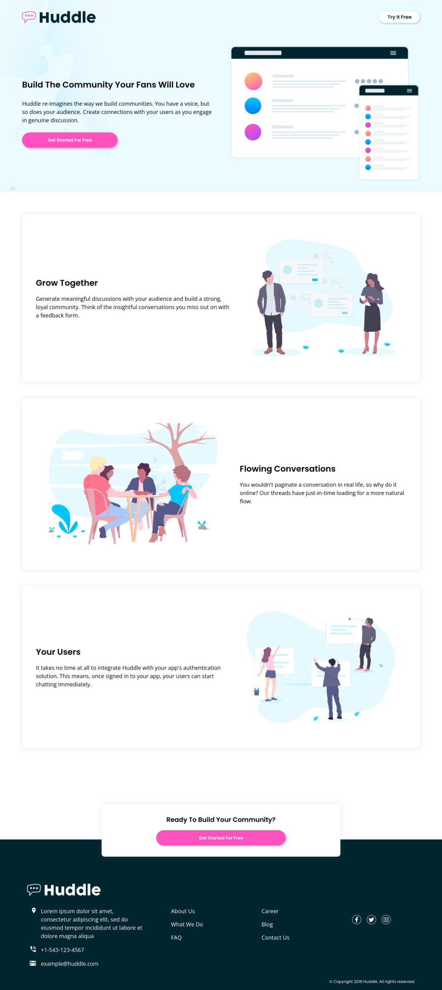
Huddle Landing Page Made with CSS Flexbox, Grid & Mobile First.
Design comparison
Solution retrospective
Hey guys, just finished this one. was a bit tricky to get around the decisions in terms of markup at the footer section but i got around it even though i repeated myself a whole lot 😅. what do you guys think of my code? and what suggestions do you have for my solution?
ps: i just noticed i didn't change the font colors on the body part. shoot!
Community feedback
- @correlucasPosted over 2 years ago
👾Hello Johnny, congratulations for your new solution!
I saw the live site and code and have nothing to say, this time you've reached an amazing level of details. Congrats 👊👊
There are two tools that can be cool to apply for your next challenges, one is called
css minifythat's a extension for VScode that reduces the css code and make file super lightweight, automatically, other is the tool in devtools calledlighthousethat gives you a full report saying what you can improve in your solution.👋 I hope this helps you and happy coding!
Marked as helpful1@johnnysedh3llloPosted over 2 years agomy brother 👊🏽, i do know about
lighthousebut gives errors the most times i use it. will try out thecss minify. i always learn something new with your feedback, thanks man0 - @DavidMorgadePosted over 2 years ago
Hello Johnny, congratulations on finishing the challenge! your layout looks awesome and it seems that the responsive is doing perfect on resizing!
I would like to give you some little advices that can improve a bit your project:
-
Try using some transitions on your buttons!, also on your social media icons, is just a line of code that will improve a lot the user experience of your application, for the 'role-buttons' you could try something like
transition: filter 0.5s ease; and for the social media icons you could usetransition: color 0.5s ease, adding acursor: pointer;to this ones will make them better! -
Regarding the structure of your html, I think you should get the
header-context(this is what developers usually call the hero) out of the header, and add it as asectionof yourmain, then in themainall those articles could get wrapped around asectiontag for a even better semantic html! (good job using the article tag, you don't see it that much here!)
Hope my feedback helps you with this little advices in your future challenges, great job!
Marked as helpful1@johnnysedh3llloPosted over 2 years agohello David, thank you for the very helpful feedback man. the last part of my css study was to be on
transitionsandanimations. i guess it's time to read more on them. and also thanks for the tip on for better semantic html will study more about that too. i really do appreciate this alot.0 -
- @AdrianoEscarabotePosted over 2 years ago
Hi Johnny, how are you?
You did a great job on this challenge, but I have a few tips that I think you'll like:
I noticed that the layout is growing a lot and the elements are getting very stretched, to fix this you can use a max-width.
For example.
We will create a div that will contain all the layout content, and in it we will place the max-width and a margin: 0 auto; to center the div. But you may be wondering what about the backgrounds? Well, we put the backgrounds in a div that is the parent of the content div.
for example:
<div class="dad"> we put the image here via the css <div class="content"> <h1>title</h1> </div> </div>The rest is really good! hope it helps... 👍
1@johnnysedh3llloPosted over 2 years agoThanks, Adriano. i appreciate the feedback alot. will try it out soon.
0
Please log in to post a comment
Log in with GitHubJoin our Discord community
Join thousands of Frontend Mentor community members taking the challenges, sharing resources, helping each other, and chatting about all things front-end!
Join our Discord
