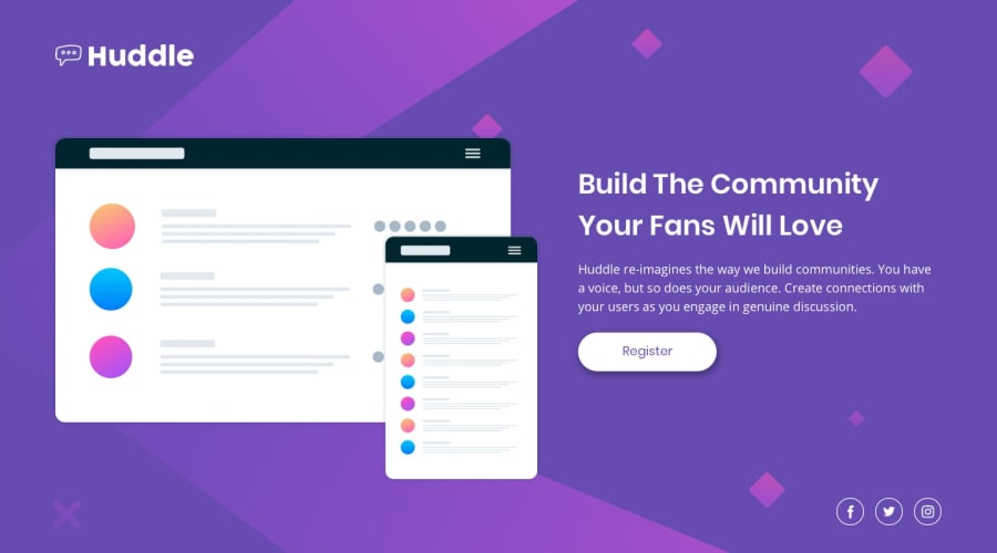
Design comparison
SolutionDesign
Solution retrospective
I'd really be grateful to receive any feedback to improve my coding skills.
Community feedback
- @pikapikamartPosted over 3 years ago
Hey, good work on this one. Both layout in desktop and mobile is really good and it responds very well.
Just some additions or suggestions:
- do not nest your
headeron themaintag. This renders theheadersomewhat useless since it won't navigated properly by a screen reader. Have it in its own block
<header></header> <main></main>- huddle logo could have the
alttexthuddleword, since it is the company's or websites name. This will be great especially when screen reader navigates on theheadertag, it will read the image as its banner. - the social media icons should be wrapped on their own
atags along with their respectivearia-labels. Example:
<a href="#" aria-label="facebook"> <i class="fab fa-facebook-f"></i> </a>- your
footerelement should also be on its own block like theheader
header
main
footer
Aside from those, really good job on this. Really responds well.
Marked as helpful1 - do not nest your
- @FluffyKasPosted over 3 years ago
Hey, your solution looks really neat and it's nicely responsive. The only thing you should really do is to center your container perhaps!
And to be nitpicky, you could look into using other units than pixels, like em, rem, ch, etc. ^^
Marked as helpful1
Please log in to post a comment
Log in with GitHubJoin our Discord community
Join thousands of Frontend Mentor community members taking the challenges, sharing resources, helping each other, and chatting about all things front-end!
Join our Discord
