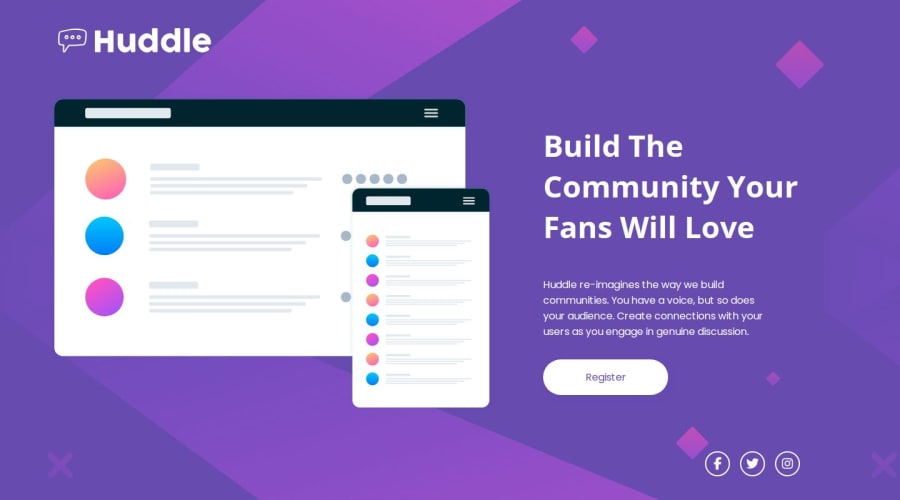
Design comparison
SolutionDesign
Solution retrospective
What are you most proud of, and what would you do differently next time?
I am most proud of my ability to build a website that's very close in comparing to the original design even without using the Figma design.
What challenges did you encounter, and how did you overcome them?I encountered a challenge while trying to add styling font awesome icons but after reading the docs, solving it was a piece of cake.
What specific areas of your project would you like help with?No really, but I'm open to feedback.
Community feedback
Please log in to post a comment
Log in with GitHubJoin our Discord community
Join thousands of Frontend Mentor community members taking the challenges, sharing resources, helping each other, and chatting about all things front-end!
Join our Discord
