Design comparison
Solution retrospective
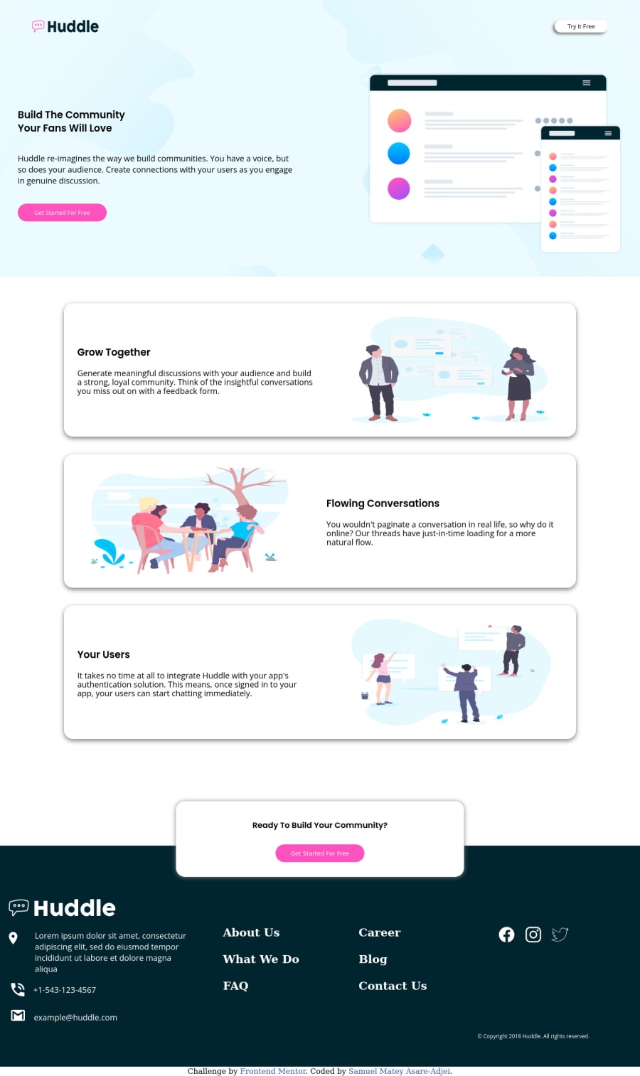
Hello Everyone. I have finally completed my first junior challenge. Is my solution code too lengthy? If it is, please let me know how I can make it less lengthy and more effective.
Community feedback
- @vanzasetiaPosted about 2 years ago
Hello, Samuel! 👋
Congratulations on completing your first junior challenge! 🎉
First, I recommend visiting the Solid Start website. It gives you an overview of web accessibility.
Some more suggestions for improvements.
- The logo and the "Try It Free" button should be outside the
main
landmark. It should be wrapped byheader
tag instead. - Remove the word "logo" from the alternative text. The semantic meaning of the
img
element will tell users that it is an image. - I think the "Try It Free" is a link instead of a
button
. I would think that when the users click that, it will navigate the users to another page (e.g. sign-up page). - For your information, anchor tags are for navigation, while the
button
elements are for actions like opening a modal, submitting a form, toggling element, etc. It is essential to use the correct elements. - I recommend taking a look at "Quick tip: Using alt text properly - The A11Y Project".
- Avoid using
br
elements for presentational purposes. Read the "Accessibility concerns" part of the MDN documentation forbr
. - Not every image needs alt text. If the image does not provide any meaningful content, such as those illustrations, consider using empty alt text (
alt=””
). This saves your screen reader users time as they navigate the page. - Don't skip the heading level. There are
h4
but there is noh3
on the page. - I recommend reading the "How-to: Accessible heading structure - The A11Y Project" article to learn how to use headings correctly.
- Those
h5
are not headings. Those are footer links. - The last section of the page should be wrapped by
footer
landmark. - The alternative text for the social media icons are correct. You only need to wrap each icon with an anchor tag. They are social media links of the company.
- Use
rem
or sometimesem
unit instead ofpx
. Usingpx
will not allow the users to control the size of the page based on their needs. I recommend reading this article aboutrem
andem
unit. This article explains both units in a simple way.
I have three recommended videos. The first one tells how hard HTML is (HTML is not easy). The other two talk about modern CSS techniques and approaches.
- Manuel Matuzović - Lost in Translation - YouTube
- Andy Bell – Be the browser’s mentor, not its micromanager - YouTube
- Stephanie Eeckles - Scaling CSS Layout Beyond Pixels - YouTube
I hope this helps! Happy coding!
1@vanzasetiaPosted about 2 years ago@sam-mantey Please don't be discouraged by this list. Some of those were also the mistakes that I made by myself. So, try to fix the issue one by one. 🙂
Marked as helpful1@sam-manteyPosted about 2 years ago@vanzasetia I really appreciate your feedback. I'm thrilled that you took the time to examine my code and find issues. Based on your recommendations, I will gradually address every problem. I appreciate the articles and the videos as well.
1 - The logo and the "Try It Free" button should be outside the
Please log in to post a comment
Log in with GitHubJoin our Discord community
Join thousands of Frontend Mentor community members taking the challenges, sharing resources, helping each other, and chatting about all things front-end!
Join our Discord