Design comparison
Solution retrospective
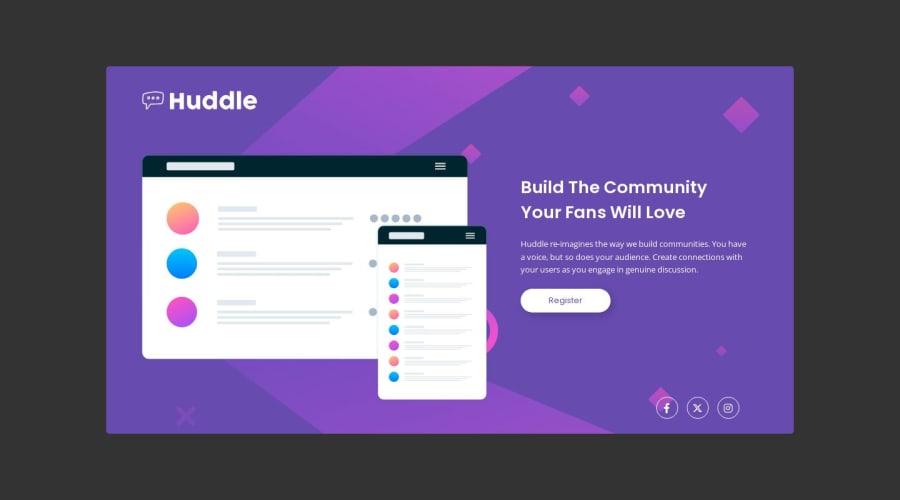
Had a tough time with the background lining up and the size of the desktop version overall. Not sure how to build without the figma files, it's just really a guess? Do you all have the same struggles? I think it looks ok but felt a little wobbly building it vs the component challenges.
Would love any feedback or suggestions. Thanks!
Community feedback
- @DivineUgorjiPosted about 1 year ago
Hello, @jclegg31 this challenge is a little tricky even though it looks simple, and congratulations on completing it 🙌
I can relate to all the struggles you mentioned on a personal level 😊 and it can be overwhelming at times, which is part of what informed my decision to get the premium plan and get the Figma files for the challenges. Even at that, it takes a lot to make pixel-perfect designs.
You can check out this Chrome extension and learn how to use it if you are very much interested in pixel perfection.
From what I can see, you are doing absolutely well 👍
- Your solution to this project is nice and thoughtfully implemented ✅
- Your solution is responsive across multiple screen sizes
- Your code is semantic, well-structured, and readable.
Keep up the good work, and may the force be with you.
All the best, and Happy coding 🙏
0
Please log in to post a comment
Log in with GitHubJoin our Discord community
Join thousands of Frontend Mentor community members taking the challenges, sharing resources, helping each other, and chatting about all things front-end!
Join our Discord