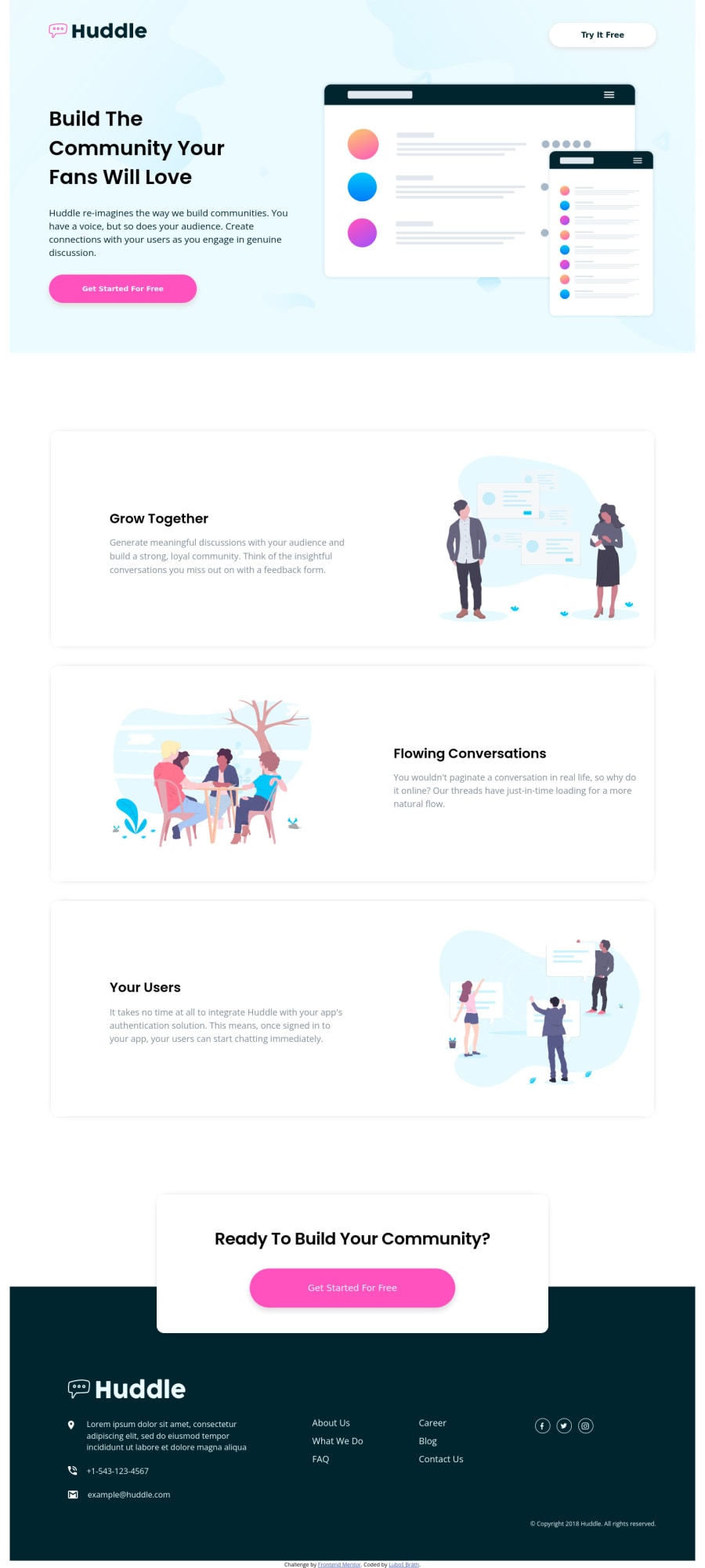
Design comparison
Solution retrospective
Hi, always when I start new challenge it look easy and then I spend with it more and more time:) I want to ask you...when you start a new project do you start with mobile version first and then you customize it to desktop version or do you start with desktop? For me it's better start with desktop version and then customize it to mobile version.
Community feedback
- @VCaramesPosted over 2 years ago
Hey there! 👋 Here are some suggestions to help improve your code:
Regarding your question,
With mobile devices being the predominant way that people view websites/content. It is more crucial than ever to ensure that your website/content looks presentable on all mobile devices. To achieve this, you start building your website/content for smaller screen first and then adjust your content for larger screens.
Remember, your are building your sites for your users, not for you. While it might better for you, it will be even better for your users.
-
The
headershould be outside of themainelement. -
The
Alt Tagdescription in the logo needs to be improved upon. The description should state the company’s name. -
The “Illustrations” serve no other purpose than to** be decorative**; They add no value. Their
Alt Tagshould left blank and have anaria-hidden=“true”to hides it from assistive technology. -
Your "buttons" were created with the incorrect element. When the user clicks on the button they should directed to a different part of you site. The
Anchor Tagwill achieve this. -
Remove the
Articleelements you used to wrap you text. It's being used incorrectly. -
There is no need for two
footerelements. Place the "attribution" inside the mainfooter. -
The “icons” (not the social media icons) in the
footerare purely decorative, so theirAlt Tagshould be left blank and have anaria-hidden=“true”to hides it from assistive technology. -
The
footerlinks should only be one list, not two. -
The “social media icons” are not decorative, they need to have an
Alt Tagwith a description.
If you have any questions or need further clarification, feel free to reach out to me.
Happy Coding! 🍂🦃
Marked as helpful0 -
- @Bredis79Posted over 2 years ago
Hi @vcarames, thank you so much for your advices. Regarding the buttons...I didn't notice that the buttons are really bad and are not able to "redirect". I was focused on design and forgot also check the functionality. Next time I would use a link inside the button or use just
a hrefand style it like button.I used the
articleto wrap the text just because I try to avoid simple div element....and maybe it isn't the best way:)In the next challenge I will start from mobile device.
One more times thanks that you checked my solution and gave me some advices...Really appreciate it.
Luboš
0@VCaramesPosted over 2 years ago@Bredis79
1.That would be a wrong of creating a button. You can only use one element or the other, you cannot combine them.
If you need an action then you will use a
buttonelement.If you need to direct your users to different parts of you site or externally, a
Anchor Tagwill do.Divwill do the job for the majority of the time.I am glad that I was able to help you out! Keep it up!
0
Please log in to post a comment
Log in with GitHubJoin our Discord community
Join thousands of Frontend Mentor community members taking the challenges, sharing resources, helping each other, and chatting about all things front-end!
Join our Discord
