


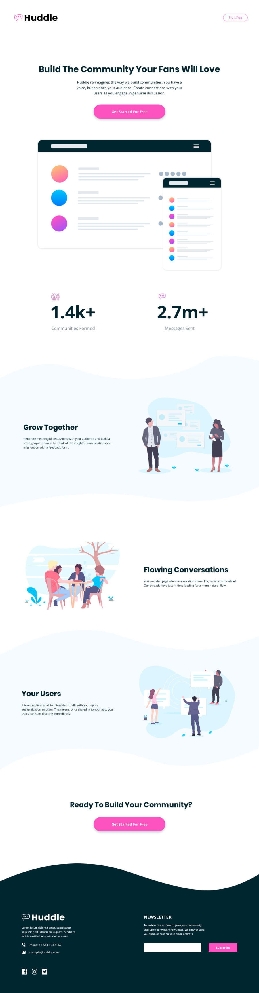
Design comparison
Solution retrospective
Hey!
I really liked the design of this challenge, that´s why I completed it.
I added a user a contact form API (web3forms) to the HTML form to collect the emails. (If you test it, your submitted data won´t be sent to my email cause I have rewritten the access key, so that it´s no longer the valid access key). When it´s tested it throws an error, but if I add the correct access key then it works (see the screenshot in the repository).
I coded the mobile size and desktop size designs for this challenge. I think the curved images should be edited so that it looks good on tablet screens. Do you have any other idea on this?
Thanks for reading and any suggestions. :)
Community feedback
- @AdrianoEscarabotePosted about 2 years ago
Hi Andrea, how are you?
I really liked the result of your project, but I have some tips that I think you will enjoy:
- The links must have an aria-label or sr-only text that tells where the link navigates the user. For example: Visit our Facebook. For images, you should set aria-hidden=” true” to be ignored by screen readers and to avoid redundancy and repetition.
To improve the design of the project, we could use a
max-widthto prevent the content from stretching at higher resolutions, and for the background images not to break together we can use a div for just the content and another just for it.so in the div that the content will be, we would put the
max-widthand themarginto center. In the image div we would let it stretch, or if you decide to use abackground-imagewe would put abackground-repeat: repeat-x;!The rest is great!
I hope it helps... 👍
Marked as helpful0@MirMurrPosted about 2 years ago@AdrianoEscarabote
Hi Adriano, I am good, I hope you are doing well!
Thank you very much for your help! Especially with the aria-labels, it has solved many errors.
I used the max-width properties in this project (I have done some corrections) and added more media-queries to improve responsiveness. Despite of the corrections, everything still seems to be too wide on the screenshot. When I open the live website and test it in responsive mode, there is no overflow on the x-axis, so I don´t really understand why it shows overflow on the screenshot above.
Best regards, Andrea
1

Please log in to post a comment
Log in with GitHub
Join our Discord community
Join thousands of Frontend Mentor community members taking the challenges, sharing resources, helping each other, and chatting about all things front-end!
Join our Discord