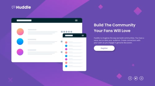
Design comparison
Solution retrospective
Hi everyone,
I am a beginner so please tell me if you see anything I can improve on.
Thank you !
Nabil-Y
Community feedback
- @kens-visualsPosted about 3 years ago
Hey @Nabil-Y 👋🏻
I have some suggestions for the project.
- First, I suggest adding
background-size: cover;
to both mobile and desktop viewport widths, because on mobile and tablet the image doesn't grow and is stuck in the corner. On desktop, doesn't reach the end of the page and there's a line underneath. So with just one line you'll fix both of the issues. - Next, I suggest putting social icons in
ul
list, because they are essentially a list, also I suggest addingcursor: pointer;
to them as well. - Lastly - I'll leave this cool article about resetting CSS, which will make more sense than my brief explanation.
I hope this was helpful 👨🏻💻 you did a great job especially with responsiveness, keep it up Cheers 👾
Marked as helpful1@Nabil-YPosted about 3 years agoHey @kens-visuals 👋🏻,
I played a bit with the background cover line and I still had some white space after the body tag and it didn't match the designs for the required width on my screen which is why I left it like that (I try too much to replicate the design screenshots exactly, maybe I shouldn't). I guess I should stick to cover for my page to fit for all screens.
Thank you for everything, I will update my project accordingly!
0@kens-visualsPosted about 3 years ago@Nabil-Y I see where you're coming from, I do the same with my projects. However, sometimes, it's just impossible to implement the background or the box-shadows as they're in the original design.
You're welcome 😇
1 - First, I suggest adding
Please log in to post a comment
Log in with GitHubJoin our Discord community
Join thousands of Frontend Mentor community members taking the challenges, sharing resources, helping each other, and chatting about all things front-end!
Join our Discord