

Design comparison

Solution retrospective
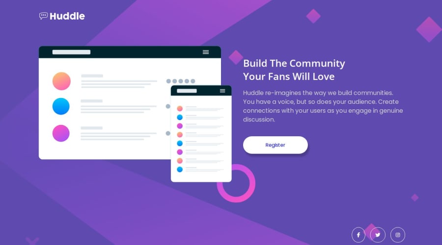
Solving the challenge all by myself regardless of little challenges I faced.
What challenges did you encounter, and how did you overcome them?I was struggling with the better positioning of the button in the desktop design and used developer tools before I was able to see what was causing the problem and then solved it.
What specific areas of your project would you like help with?I think background image positioning, and any suggestion or feedback would be very helpful in helping me to build the future I want.
Community feedback
- @elClassico-engPosted 2 months ago
Hello! Your solution looks impressive!😉
I noticed that you have one icon with the
fa-brandsclass,border-radiusdoes not work correctly.You can try doing this:
width: 40px;
height: 40px;
display: flex;
flex-direction: column;
justify-content: center;
align-items: center;
You can change the width and height of your icons and achieve the desired result.
I wish you good luck!
0

Please log in to post a comment
Log in with GitHubJoin our Discord community
Join thousands of Frontend Mentor community members taking the challenges, sharing resources, helping each other, and chatting about all things front-end!
Join our Discord