@pikapikamart
Posted
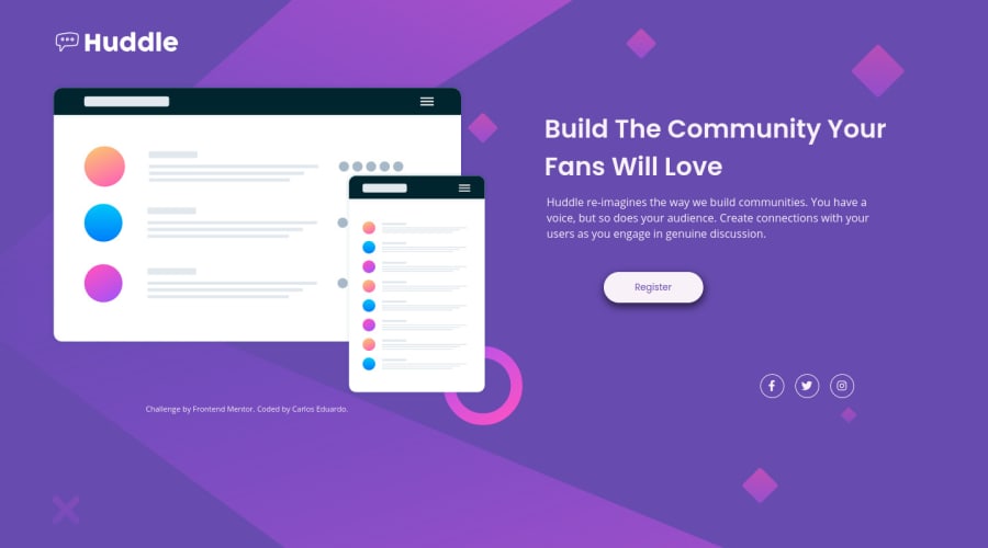
Hey, great work on this one. The layout in desktop looks good and the mobile state as well. But the responsiveness is not really. Right now the layout does not scale with screen changes, you might want to look at that one.
Some suggestions would be:
- Lose the word
logo
on the website image. Avoid adding those words that relates to "graphic" such as "logo, image, icon". Assistive tech will handle those for you. - Do not nest the
footer
inside themain
element, have it in its own row in the html. A typical structure would look like:
<header /> # if there is a header
<main />
<footer />
- The
register
should have useda
tag and notbutton
since it is more like a go to link to sign up instead of signup pop-up modal. - Lose the word
illustration
on the hero image and maybe more cleareralt
value likealt="huddle social media mockup"
- Those social media links should use
a
tag since those are links. - Each
a
tag that wraps the social media links should havearia-label
attribute on it, the value would correspond to the social media it is bounded to. For example, thea
tag that wraps the facebook should havearia-label="facebook"
. This way, users will know where this link would take them.
Aside from those above, great work. But the responsiveness should be improved. If you finalizes a layout, make sure to inspect the website in dev tools, change the screen sizes, check if layout looks good.
Marked as helpful
@carlosecosmesilva
Posted
Thanks for tips! @pikamart