Submitted over 3 years ago
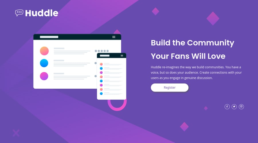
Huddle Landing Page! Designed with responsive sizes
@sportiz91
Design comparison
SolutionDesign
Solution retrospective
Designed in part with Bootstrap. On mobile and table view, the design is the mobile one. On desktop (>992 px) the design corresponds to desktop one.
I had the following issues, that couldn't solve:
- Background image in some desktops heights doesn't go all the way down and get cut in the middle.
- On the other hand, when the desktop width in not that large (around 1000px), the background image occupies a large height and the footer ends early. My intention was to do a one pager that always look aproximately the same in all desktop sizes.
Any idea how can I solve this issues?
PD: learnt a lot about responsive desing doing this website.
Community feedback
Please log in to post a comment
Log in with GitHubJoin our Discord community
Join thousands of Frontend Mentor community members taking the challenges, sharing resources, helping each other, and chatting about all things front-end!
Join our Discord
