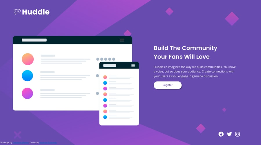
Design comparison
Solution retrospective
My 3rd Frontend Mentor Challenge, this time I am building a landing page. This will be the first landing page that I have built. Built with mobile design first in mind. I like to finish the mobile version first, then I set the media to min-width: 800px, and design the desktop version from that.
Web design will always be continued learning. As the years pass and technology grows, things will change for the markup language and web styling, that's why I will always be learning. But for now, mobile first, responsiveness, CSS Grid and Flexbox are what I am currently working on right now.
Community feedback
- @hatemhenchirPosted about 2 years ago
Hey there! 👋 Here are some suggestions to help improve your code:
- All images must have alternate text. You can do it like this <img src="./images/bg-desktop.svg" alt="say something">
- In the social icon. Replace the div with footer
- Your "Icons" were created with the incorrect element. When the user clicks on the icon, they should be directed to a different part of your site. The Anchor Tag will achieve this.
- Implement a Mobile First approach 📱 > 🖥 With mobile devices being the predominant way that people view websites/content. It is more crucial than ever to ensure that your website/content looks presentable on all mobile devices. To achieve this, you start building your website/content for smaller screen first and then adjust your content for larger screens.
If you have any questions or need further clarification, feel free to reach out to me.
Happy Coding! 🍂🦃
1
Please log in to post a comment
Log in with GitHubJoin our Discord community
Join thousands of Frontend Mentor community members taking the challenges, sharing resources, helping each other, and chatting about all things front-end!
Join our Discord
