

Design comparison
SolutionDesign

Solution retrospective
Hello Everyone !
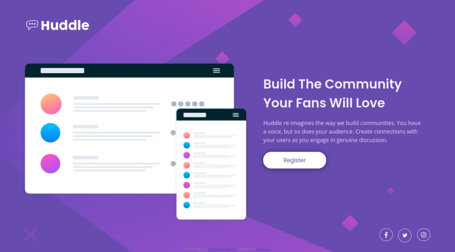
This is my solution for the challenge : Huddle Landing Page
I mainly tried to focus on the responsive design, I'm quite proud of the result even if I notice afterwards that there are still some points that can be improved.
Any constructive advice or tips are good to take
Thank you for your time and happy coding :)
Please log in to post a comment
Log in with GitHubCommunity feedback
- @kenreibman
Great submission!
I really like your use of grid for the main section.
I think you should start your desktop-to-mobile breakpoint at
~1000pxSince the viewport widths between1000pxand700pxlook awkward as a tablet user.- Two out of the three social icons are missing a hover state as well.
Other than that, it looks great. Keep it up!
Marked as helpful

Join our Discord community
Join thousands of Frontend Mentor community members taking the challenges, sharing resources, helping each other, and chatting about all things front-end!
Join our Discord