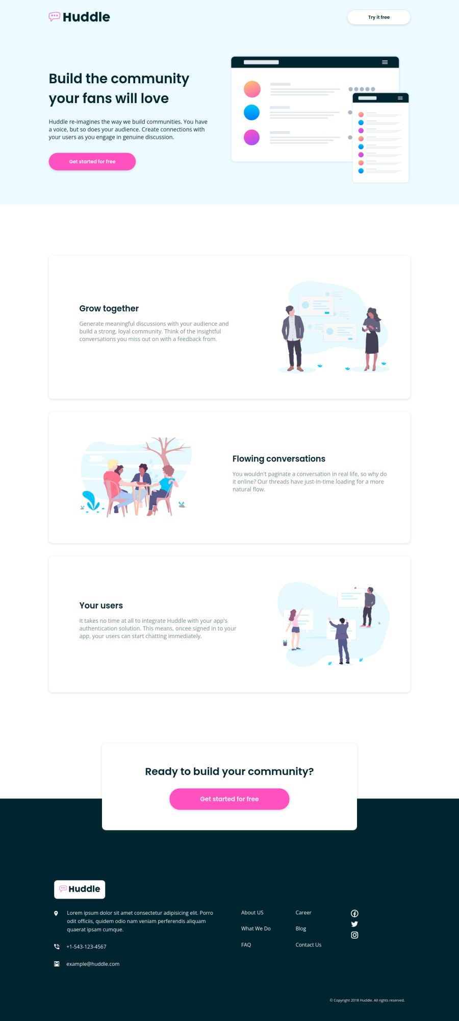
Huddle landing page challenge (responsive)
Design comparison
Solution retrospective
Hello world! Any suggestions or improvements !! Thank you (:
Please log in to post a comment
Log in with GitHubCommunity feedback
- P@brodiewebdt
This is very good. Looks good on all screen resolutions.
Change the H3's to H2's. You don't want to skip heading levels. Give the H2's the card__heading class and you won't have to redesgn the headings. Add ALT text to the images. All images should have ALT text for accessibility. Add aria-label="facebook link" etc.. to the social icons A tag for accessibility. These things should clear the accessibility warnings.
Download AXE DevTools and you can clear accessibility warnings while you code. https://www.deque.com/axe/devtools/
Hope this helps.
Marked as helpful - @codezeloss
Wow, thank you so much for the time you put on that comment, with all those details... Ok, I will work on all those accessibility problems (; Thanks again! Have a nice day.
Join our Discord community
Join thousands of Frontend Mentor community members taking the challenges, sharing resources, helping each other, and chatting about all things front-end!
Join our Discord
