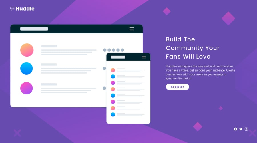
Design comparison
Solution retrospective
Any feedback what I did wrong with deskop design that when I try to do media queries is such a mess and flex-direction: column doesn't work.
Thanks in advance
Community feedback
- @WillearysonPosted about 3 years ago
olá, vc pode usar essas linhas de css para deixar uma borda redonda e melhorar os espaçamentos, lembre-se de tirar o padding-left de 10px e deixar em 0
hello, you can use these css lines to make a rounded edge and improve spacing, remember to take the padding-left off of 10px and leave it at 0
.icons-link a{ width: 40px; height: 40px; padding:0; margin-left:20px display: flex; justify-content: center; align-items: center; border: 2px solid #FFF; border-radius: 50%; }
0
Please log in to post a comment
Log in with GitHubJoin our Discord community
Join thousands of Frontend Mentor community members taking the challenges, sharing resources, helping each other, and chatting about all things front-end!
Join our Discord
