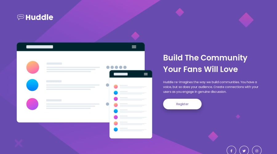
Design comparison
SolutionDesign
Solution retrospective
What are you most proud of, and what would you do differently next time?
Huddle landing page with single introductory section 👨🏽💻
Technologies used 🚀✨
- HTML 🏗
- CSS️ 🎨
Features 🎯
- Semantic Arrangement ✨
- Dynamic Animations 🎭
- Prettier Arrangement 🌈
Challenges Faced and Solutions 💪
-
Achieving a responsive design was on point also I would focus more on optimizing the animations for performance.
-
It was challenging to get a precise and pixel-perfect design since I had no access to the Figma file. I tried using some designer software like Affinity or Adobe Illustrator to figure out some dimensions.
You can check me out
🌌 Feel free to add your opinion about any possible improvements to the code and accessibility. 🙃
Community feedback
Please log in to post a comment
Log in with GitHubJoin our Discord community
Join thousands of Frontend Mentor community members taking the challenges, sharing resources, helping each other, and chatting about all things front-end!
Join our Discord
