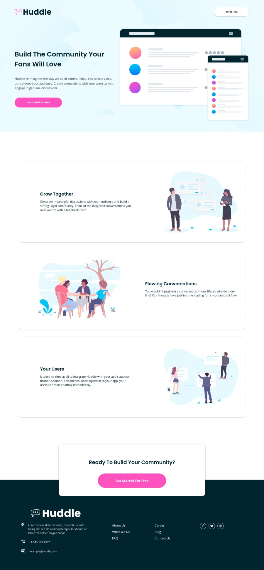
Huddle Landing Page Blocks (CSS GRID, FLEXBLOX)🎆
Design comparison
Solution retrospective
Well this challenge helped me to practice more in mobile design, well for me that was what I had more complications, but I think I improved a little more in terms of accessibility, and I have more notion of how to position and align the html elements in a more effective way and without so many complications when moving to mobile design. If you have any corrections or suggestions to improve my code please let me know in the comments, happy coding.
Community feedback
- @diversisPosted about 2 years ago
Hello! Page looks fine overall. Noticed issue with hero section text (you called it build section) and "Try it free" button: they have light text on light background. Also footer text is same color as selection.
1
Please log in to post a comment
Log in with GitHubJoin our Discord community
Join thousands of Frontend Mentor community members taking the challenges, sharing resources, helping each other, and chatting about all things front-end!
Join our Discord

