Submitted over 4 years ago
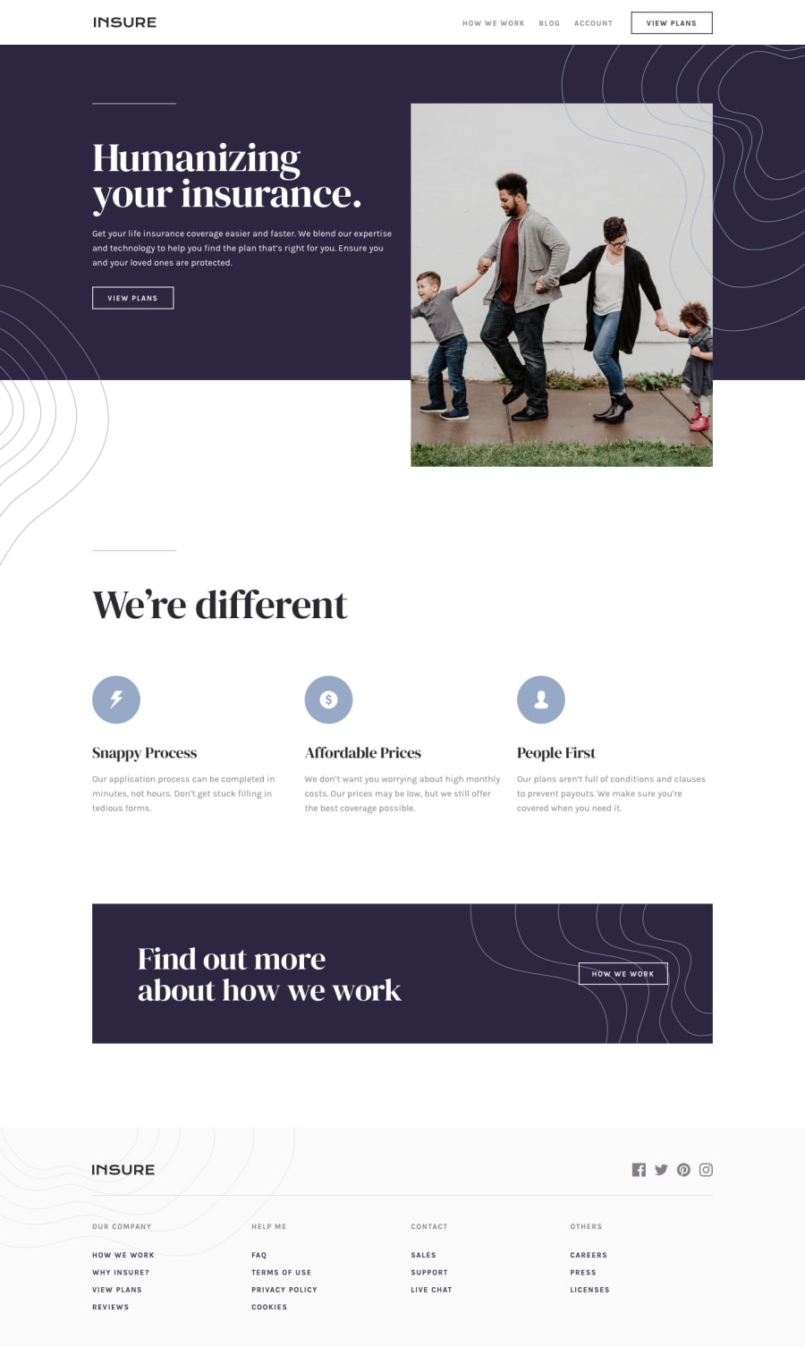
Huddle landing page and the mobile version is in progress
@yaakoubox
Design comparison
SolutionDesign
Solution retrospective
let me get your feedback please :) notification : android version isn't ready yet
Community feedback
- @mattstuddertPosted over 4 years ago
Nice work on this challenge! I hope you enjoyed working through it. Here are some pointers after taking a look at your code:
- Your media query is set to
max-width: 375pxat the moment. This means that from376pxup to a small desktop size the content doesn't fit on the screen. I'd recommend reviewing this and maybe adding another breakpoint. - Your desktop layout is very nearly matched up to the design. I'd recommend going through it one more time and doing one last round of refinements to try and get your project as close to the design as possible. Accuracy is a key part of being a front-end developer, so it's a skill that's well worth taking some time to build.
- Take a look at the HTML validation errors in the report and try resolving those issues
Keep up the great work!
1 - Your media query is set to
Please log in to post a comment
Log in with GitHubJoin our Discord community
Join thousands of Frontend Mentor community members taking the challenges, sharing resources, helping each other, and chatting about all things front-end!
Join our Discord
