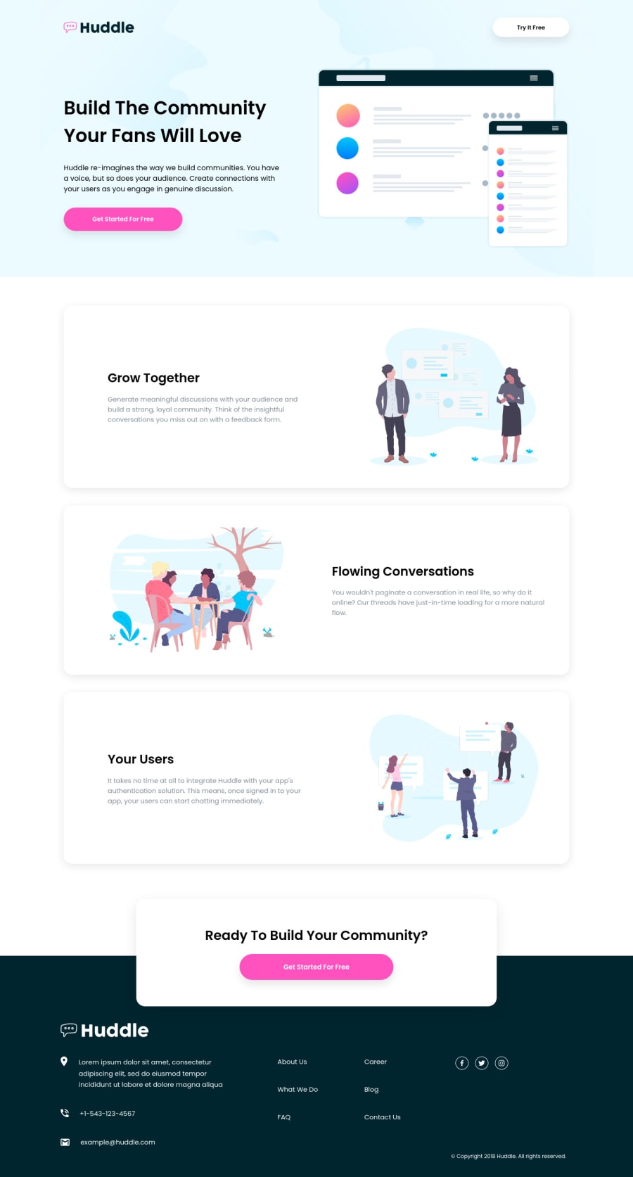
Design comparison
Solution retrospective
Hey✨ hope everyone is okay. Just finished this using Flexbox and Grid , any feedback will be appreciated.
Community feedback
- @steventobenPosted almost 4 years ago
I think it looks pretty good, but I think you used way to much grid and flexbox, It seems pretty unnecessary in a lot of places, especially with a pretty basic layout like this. Also I'm not sure what's going on with your font sizes. You shouldn't set the base font to 62.5%, and your font-sizes for the same exact elements are different throughout. Some buttons have larger font-sizes than others, there doesn't seem to be any form of a consistent typography scale being applied throughout
0@samuelpalaciosdevPosted almost 4 years ago@steventoben Hey steve, thank you for letting me know your point of view. What do you suggest using the default base font size? I use the percent because as far as I know it helps on responsiveness. Also I used different font-sizes in the buttons, I know and I notice that and forget to change them.
0 - @ApplePieGiraffePosted almost 4 years ago
Hello there, Samuel Palacios! 👋
Good work on this challenge! 👍 Your solution looks great and scales up/down very nicely! 🙌
I only suggest perhaps adding a hover state to the navigation links and the social media icons in the footer of the page. 😉
Keep coding (and happy coding, too)! 😁
0@samuelpalaciosdevPosted almost 4 years ago@ApplePieGiraffe Hey bro, thank u for your kind words and your suggestion! 💛
0
Please log in to post a comment
Log in with GitHubJoin our Discord community
Join thousands of Frontend Mentor community members taking the challenges, sharing resources, helping each other, and chatting about all things front-end!
Join our Discord
