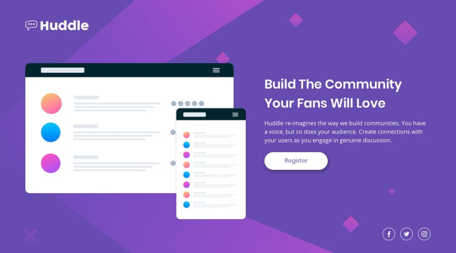
Design comparison
Solution retrospective
Please feel free to tell if there's anything i could've done better or differently also if there are any bad practices please let me know thank you for your feedback
Community feedback
- @visualdennissPosted over 1 year ago
Congrats on completing the challenge successfully! Everything looks great.
It looks like your background is repeating, causing unwanted content at the bottom, you could avoid that by using adding: background-repeat: no-repeat; in container.
Also the footer icons look a bit far away from the main content, so you might consider having them a bit closer to the content.
Hope you find this feedback helpful!
Marked as helpful0 - @0xabdulPosted over 1 year ago
Hello there ! 👋 Congratulations you finished the Huddle landing page ...🎉
- Some suggestions for you improve your code🤔
Html 🏷️:
- for Accessibility reports using the non-semantic elements (or) semantic elements..
- semantic elements :
<aside> , <artical> , <main>, <header> ,<section><footer>, <form> ect.. - non- semantic elements :
<div> , <span> ect ... - for easy way to clear the Accessibility reports using non semantic elements Ex :
<div class="container" role="main"> //Whole html code wraping the div tag named "container"..📍 </div>- the html code should be contained one main landmark..❗
- using the <h1> <h2> <h3> tags in order way , for Accessibility reports
- I Hope it's useful for you and wating for your next project ❤️
- Happy Coding 😃
Marked as helpful0
Please log in to post a comment
Log in with GitHubJoin our Discord community
Join thousands of Frontend Mentor community members taking the challenges, sharing resources, helping each other, and chatting about all things front-end!
Join our Discord
