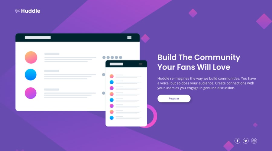
Design comparison
SolutionDesign
Solution retrospective
Loved this one! Ended up just creating my own social SVGs with Illustrator because it was a little hard to find the perfect ones.
Community feedback
- @vanzasetiaPosted about 2 years ago
Hi, Rachel! 👋
Congratulations on finishing this challenge! 🎉 It's amazing that you can create your own social media icons. Those icons look the same as the original design. 👏
Here are some suggestions for improvements.
- The alternative text of the logo should not contain the word "logo". The semantic meaning of the
img
element is already enough. - Not every image needs alt text. If the image does not provide any meaningful content, such as the
illustration-mockups.svg
, consider using empty alt text (alt=””
). This saves your screen reader users time as they navigate the page. - I recommend taking a look at "Quick tip: Using alt text properly - The A11Y Project".
- Always specify the
type
of thebutton
. In this case, set the type of them astype="button"
. It will prevent the button from behaving unexpectedly. - Wrap each of the social media icons with an anchor tag. They are social media links of the company.
- Use the
em
unit for media queries. It adapts when the users change their font size setting. Here are some references.
I hope this helps. Happy coding!
0 - The alternative text of the logo should not contain the word "logo". The semantic meaning of the
Please log in to post a comment
Log in with GitHubJoin our Discord community
Join thousands of Frontend Mentor community members taking the challenges, sharing resources, helping each other, and chatting about all things front-end!
Join our Discord