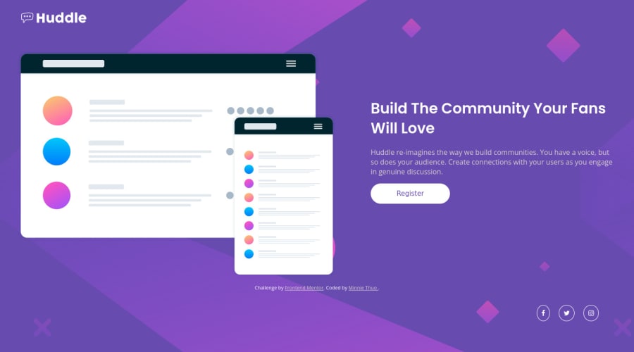
Design comparison
Solution retrospective
his is my first time creating a landing page, the main issue was the responsiveness but I think I tried to make it work. with responsive designs is it better to use percentages as units of things like div widths and such?
Community feedback
- @Kaji17Posted over 1 year ago
**Helo @minnieme20 congratulation for your solution ** I have some tips to increase your code and good practice.
-
01 it is important to put an alternative text in tag <img> with properties
alt: -
<img src="images/logo.svg" class="logo" alt="logo"> -
02 for more semanctic it preferable to use <h1> <h2> ... for display title in your page. Use
<h1>for title 'Build The Community Your Fans Will Love'. ```<h1 class="main-p">Build The Community Your Fans Will Love</h1>` -
03 set attribute 'type' in tag
<button>: <button type="button">Register</button> -
04 for display social media icon instead of putting
class="social"inposition="fixed"you can put this container inside the info divclass="info"inposition="relative "andclass="social"inposition="absolute "like theclass="social"will adapt according to changes inclass="info". I hope it will help you
Marked as helpful0 -
- @0xabdulkhaliqPosted over 1 year ago
Hello there 👋. Congratulations on successfully completing the challenge! 🎉
- I have other recommendations regarding your code that I believe will be of great interest to you.
HTML 🏷️:
- This solution generates accessibility error reports, "All page content should be contained by landmarks" is due to
non-semanticmarkup, which lack landmark for a webpage
- So fix it by replacing the
<div class="container">element with the semantic element<main>in yourindex.htmlfile to improve accessibility and organization of your page.
- What is meant by landmark ?, They used to define major sections of your page instead of relying on generic elements like
<div>or<span>
- They convey the structure of your page. For example, the
<main>element should include all content directly related to the page's main idea, so there should only be one per page
iMAGES 📸:
alttext is a descriptive text attribute added to an HTML image tag that provides a textual description of an image for users who are visually impaired or cannot see the image for any other reason.
- The purpose of
alttext is to convey the meaning and context of an image to these users so that they can understand the content and information conveyed by the image.
- But here, The
svg'sare just used as a decoration material.
- Meanwhile it also needs an
altattribute withemptyvalue
- Eg:
<img src="./images/illustration-mockups.svg" alt="" aria-hidden="true">
HEADINGS ⚠️:
- And, this solution has also generated accessibility error report due to lack of level-one heading
<h1>
- Every site must want at least one
h1element identifying and describing the main content of the page.
- An
h1heading provides an important navigation point for users of assistive technologies, allowing them to easily find the main content of the page.
- So we want to add a level-one heading to improve accessibility by reading aloud the heading by screen readers, you can achieve this by adding a
sr-onlyclass to hide it from visual users (it will be useful for visually impaired users)
.
I hope you find this helpful 😄 Above all, the solution you submitted is great !
Happy coding!
Marked as helpful0
Please log in to post a comment
Log in with GitHubJoin our Discord community
Join thousands of Frontend Mentor community members taking the challenges, sharing resources, helping each other, and chatting about all things front-end!
Join our Discord
