Design comparison
SolutionDesign
Solution retrospective
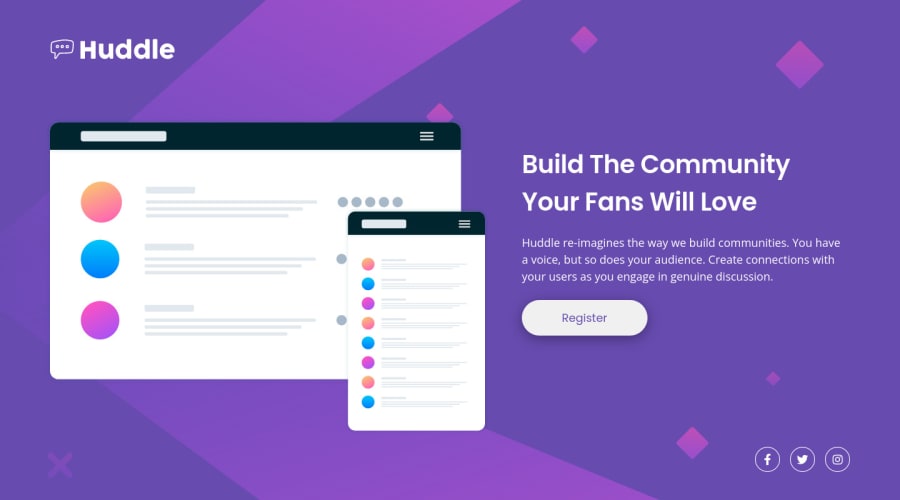
I had some difficulties in understanding which solution to adopt for social icons, I would like to know if there is a better solution than mine in this situation.
Community feedback
- @brodiewebdtPosted almost 3 years ago
This looks good. You should set the break-point lower, as it doesn't switch to desktop until the screen is very wide. You did a great job with the icons. There are multiple ways to solve any problem, no one right way. No issues in the report either. Nice job.
0@Giulo25Posted almost 3 years ago@brodiewebdt Hi David, thanks for the feedback. I just updated my solution, it is now fully responsive, check it out if you like
1
Please log in to post a comment
Log in with GitHubJoin our Discord community
Join thousands of Frontend Mentor community members taking the challenges, sharing resources, helping each other, and chatting about all things front-end!
Join our Discord
