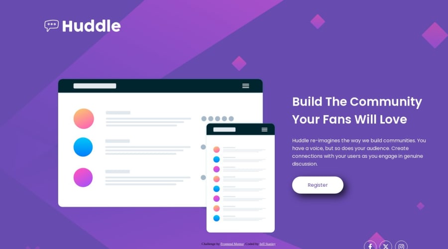
Design comparison
Solution retrospective
This one was a bit deceptive for me!
I had a hard time keeping the SVG background consistent and at times I just scrapped the whole layout and started over. My one question is my concern regarding the responsive layout..
I'm not necessarily looking for an answer but I'd like to know if it was possible to keep the layout exactly the same as the reference image for desktop. I spent a lot of time trying to keep everything lined up(specifically the diamond above illustration svg) and ultimately just made an assumption that maybe I was approaching it incorrectly.
Community feedback
Please log in to post a comment
Log in with GitHubJoin our Discord community
Join thousands of Frontend Mentor community members taking the challenges, sharing resources, helping each other, and chatting about all things front-end!
Join our Discord
