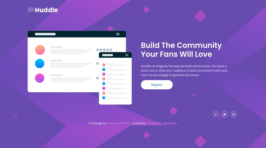
Design comparison
SolutionDesign
Solution retrospective
Hi Front-end mentor community!
Finished my third project on frontendmentor.io, I would really appreciate and love if I can get some feedback from the community concerning my flaws and strengths.
Community feedback
- @benjoquilarioPosted over 2 years ago
Hi Olisaemeka, great job on finishing this one, it looks good and response rather well.
some suggestion to improve your code:
- You need to wrap your content class into
main
tag so that it will fix the accessibility issues. - you need to add a aria-label on social icon.
aria-label
simply used to provide a text alternative to an element that has no visible text on the screen. - and also need to remove some
em
unit of the page, use EM where you have to make more scaling than the root font size and use. And use REM where you need value according to the root there you can use REM units
Keep coding and good luck
cheers, benjo
Marked as helpful0 - You need to wrap your content class into
Please log in to post a comment
Log in with GitHubJoin our Discord community
Join thousands of Frontend Mentor community members taking the challenges, sharing resources, helping each other, and chatting about all things front-end!
Join our Discord