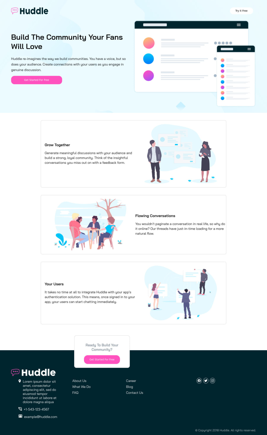
Design comparison
Solution retrospective
Any Tips On how to align footer section [location tags -icon] and content properly centered might be helpful
Community feedback
- @sahand-masolehPosted about 2 years ago
Hi Keerthi,
You can wrap the content of your footer in a wrapper div and center that coupled with a max-width property.
I would do that for the rest of the page too, because currently your page breaks on ultrawide monitors, it just keeps growing.
Marked as helpful0@KeerthiVasan-NPosted about 2 years ago@sahand-masoleh Thank you Sir for your valuable feedback I've seen your solution for huddle curved page solution,It looks great!!. I'm not able to control the width of the curvey Images so i'm having horizontal scrolling. Any tips to make it fit to center and avoid horizontal scrooling might be helpful
1@sahand-masolehPosted about 2 years ago@KeerthiVasan-N No problem,
I don't see any scrolling on that solution so I assume you've fixed it. Congrats then!
But on this one there's a bit of scrolling caused by your "ff" class which has an absolute
margin-left.Marked as helpful0 - @Chiemeka2006Posted about 2 years ago
@keerthiVasam-N why dont u make the image and the text smalller cause in the preview for your site its cut off maybe u made theri measurements too much. Also for the social images ill advice u to add padding and make sure you have the box-sizing-border-box property applied to the universal indicator. Hope this helps. <£ <3 :D
Marked as helpful0
Please log in to post a comment
Log in with GitHubJoin our Discord community
Join thousands of Frontend Mentor community members taking the challenges, sharing resources, helping each other, and chatting about all things front-end!
Join our Discord
