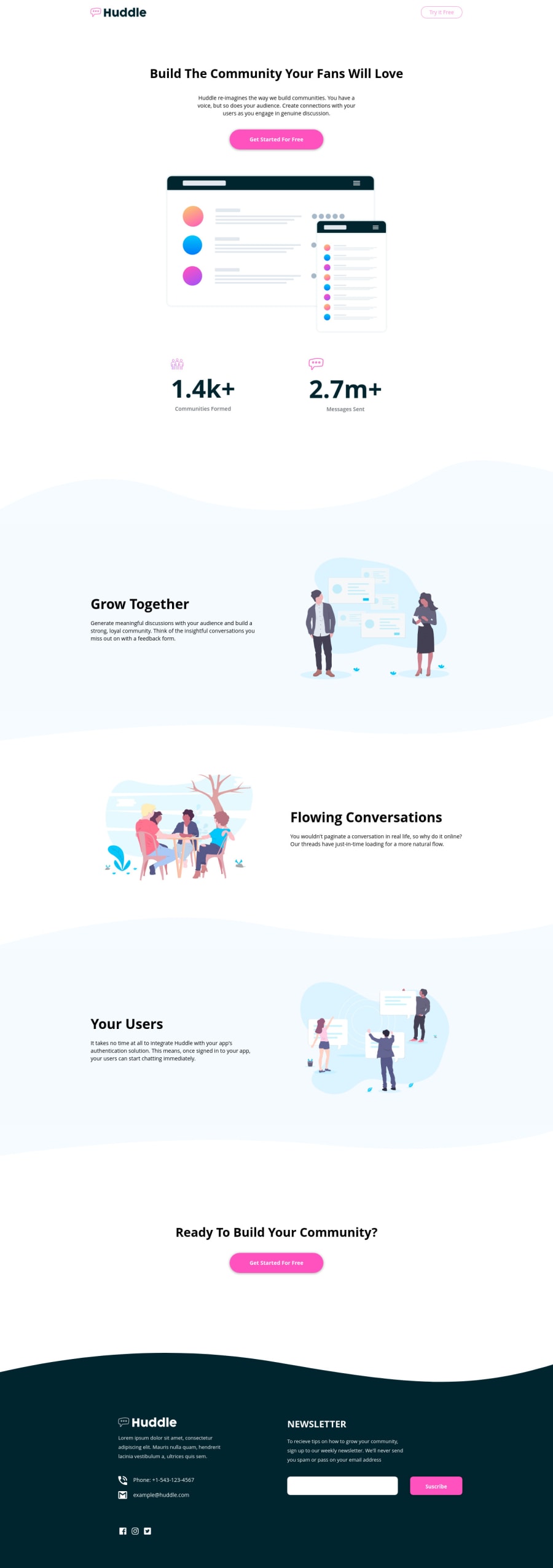
Design comparison
SolutionDesign
Solution retrospective
Hi everyone! This is my solution for the Huddle landing page with curved sections solution challenge.
Regarding the original design, I added some modifications:
- I added a drop shadow at the navbar when the scroll is greater than 50 viewport height
- I changed the scrollbar design to a more rounded style
- I added multiple breakpoints
Thanks for your time, and I´m open to receive opinions!
Community feedback
Please log in to post a comment
Log in with GitHubJoin our Discord community
Join thousands of Frontend Mentor community members taking the challenges, sharing resources, helping each other, and chatting about all things front-end!
Join our Discord
