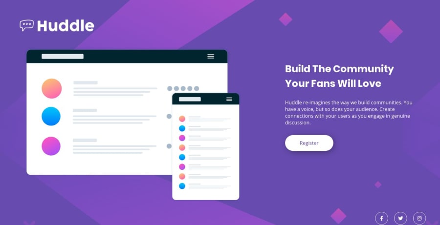
Hubble landing page as a first practicing project
Design comparison
Solution retrospective
This is my first project out of college and probably you will find a lot of newbie mistakes :P
Community feedback
- @adarshcodesPosted almost 5 years ago
Hi! @marcomedeirosfh, Congratulations on submitting your first solution on the front-end mentor🙂.
- About your design:
- It looks nice, you can increase the font-size a bit of main-heading.
- About your responsiveness:
- Add few more breakpoints like at 1055px, 680px and at 480px.
- About your code:
- The code looks pretty clean.
- Accessibility and HTML issues:
- Great👍 no issues.
Keep Coding🐱💻
1 - @kseniusPosted almost 5 years ago
Hi! Congratulations on your first project!
I've looked at the preview and code of your site and I'd like to make a couple of suggestions:
- I'd recommend not to use ID selectors in CSS. Using classes is more convenient and beneficial. Here's the article about the reasons.
I'd also recommend you to learn more about different approaches to CSS, such as CSS naming conventions, for example BEM methodology. It really helps to organize code better, not only CSS but also HTML. Personally my code has become much better with BEM.
- The second suggestion is about responsiveness. Your site is displayed incorrectly between 376px and approximately 1000px. You can solve this by increasing the value of your breakpoint (375px), for example.
1@marcomedeirosfhPosted almost 5 years agoHi @ksenius !
I will definitely keep your feedback in mind for my next project.
Thanks a lot for your feedback!
0
Please log in to post a comment
Log in with GitHubJoin our Discord community
Join thousands of Frontend Mentor community members taking the challenges, sharing resources, helping each other, and chatting about all things front-end!
Join our Discord
