Submitted almost 2 years ago
https://master--venerable-madeleine-9b6753.netlify.app/

@TroneciAndrei

Design comparison
SolutionDesign

Solution retrospective
I know its not a perfect website and doesn't follow the exact design but I'm still learning that's why I practice vanilla css and javascript I don't wanna use any framework right now to make these challenges.
But I will appreciate any feedback and tips to improve my skills
Thank you all!
Community feedback
- @ApplePieGiraffePosted almost 2 years ago
Hi, Troneci Andrei! 👋
Nice job on this challenge! 👏 Your solution looks good! 👍
A couple of things I suggest are,
- Adding some space between the content of the header and the edges of the screen in the desktop/tablet view of the site to ensure that the content isn't right up against the edge of the screen when the width of the screen decreases.
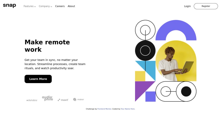
- Adding some more descriptive alt text to the main image (as "Main image" doesn't really describe the purpose/content of the image).
- The "Register" and "Log more" elements may looks like buttons, but they are likely to take the user to another page when clicked, so they should be links instead. It may be helpful to keep in mind that it is not uncommon to style links like buttons, so you should always think about the function of an element rather than it's styling when deciding which HTML element to use. 😉
- Wrapping the items in the dropdown menus in the header of the page in
atags to turn them into links.
Hope you find these suggestions helpful. 😊
Keep coding (and happy coding, too)! 😁
Marked as helpful1@TroneciAndreiPosted almost 2 years ago@ApplePieGiraffe Thank you for your feedback I will make all the changes that you suggest
Happy coding!
1

Please log in to post a comment
Log in with GitHub
Join our Discord community
Join thousands of Frontend Mentor community members taking the challenges, sharing resources, helping each other, and chatting about all things front-end!
Join our Discord