https://github.com/Papi84/four-card-feature-section-Master/blob/main/s


Design comparison

Solution retrospective
I’m most proud of the responsive design I implemented, ensuring the project looks great on both mobile and desktop screens. It was my exciting using CSS Grid, and I’m thrilled with how it turned out.
Next time, I would spend more time on the planning phase to avoid last-minute changes. I also realized the importance of testing more thoroughly on different browsers, as I encountered some compatibility issues late in the project.
What challenges did you encounter, and how did you overcome them?One of the main challenges I faced was ensuring the design was fully responsive across different devices. It was difficult to balance the layout so that it looked good on both mobile and desktop screens. This challenge helped me better understand responsive design principles and improved my skills in creating layouts that work well on different devices.
What specific areas of your project would you like help with?I would like help with improving the accessibility of my design. Ensuring that the project is user-friendly for people with disabilities is important to me, but I'm not sure if I’ve implemented the best practices effectively. While I’ve included some basic accessibility features, I’m unsure if I’ve covered all the necessary aspects, such as color contrast and keyboard navigation. I would appreciate any feedback or resources on improving accessibility, particularly in ensuring that the design is fully navigable using only a keyboard and that all visual elements meet contrast standards.
Community feedback
- @ownedbyanonymousPosted 8 months ago
Hey Papi 👋🏾,
Well done on completing the challenge. Your spacing almost matches the spacing shown in the designs which is impressive 🔥🔥. I also noticed you made use of semantic tags throughout your codebase which is a step in the right direction to improving your webpage's accessibility as screen readers and other assistive technologies rely on semantic structure of a webpage to understand and navigate its content.I have a few pointers on how you can make your solution match the designs and I hope you find the feedback useful.
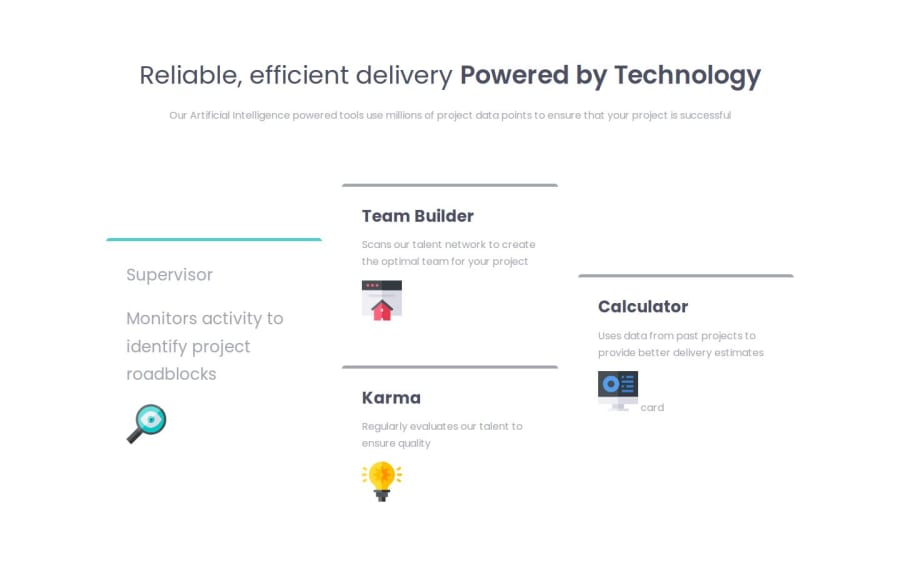
- In the header section l think we could make use of the h2 element instead of the span element as we want the "Powered by technology" text to be below our h1 heading both on mobile and desktop. Wrapping the "Powered by technology" text inside a span and nesting it inside the h1 element will put the text side by side.
<header> <h1>Reliable, efficient delivery</h1> <h2>Powered by technology</h2> <p> Our Artificial Intelligence powered tools use millions of project data points to ensure that your project is successful </p> </header>- To make our paragraph span through 2 lines as shown in the designs we could give the paragraph element a width in CSS. Below is an example of how we could achieve that
header p{
 width: 13rem;
}
The code above targets all paragraph elements, which are descendants of the header element, and gives them a width of 36rem (which translates to 540px assuming you are using the root font size of 15px as specified in the style guide document found in the project files)
html{ font-size: 15px; }- Noticed only the Supervisor card has a teal border color at the top and the rest of the cards have a gray border color at the top which is different from what is shown in the designs. You have the classes specified in HTML already, all you need to do is to declare them in your CSS. Here is a code suggestion of how your CSS should look like, in order to get the different border colors at the top of each card:
.border-red { border-color: hsl(0, 78%, 62%); } .border-yellow{ border-color: hsl(34, 97%, 64%); } .border-blue{ border-color: hsl(212, 86%, 64%); }-
You will need to correct the typos on the h2 tags as they might affect styling. You typed hc2 instead of h2 in a couple of places.
-
The solution you provided is not responsive. On smaller screens, the cards are supposed to show in a single column with 4 rows. You could make use of the implicit grid layout which requires you to only have a grid container defined and under the hood 1 column is created and each grid item occupies it's own row.
.grid-container{
 display: grid;
}
Then on bigger screens (tablets, laptops, and desktops) is where you are supposed to have your current layout you have, so you can also make use of media-queries.
Hope you find this feedback useful and if you do please mark it useful. If you have any questions and/or need assistance you are more than welcome to reach out.
Marked as helpful0 - @Papi84Posted 8 months ago
@ownedbyAnanimous Thank you so much for the corrections and suggestions; they were incredibly helpful. I will definitely use your tips to make my work look even better.
0

Please log in to post a comment
Log in with GitHub
Join our Discord community
Join thousands of Frontend Mentor community members taking the challenges, sharing resources, helping each other, and chatting about all things front-end!
Join our Discord