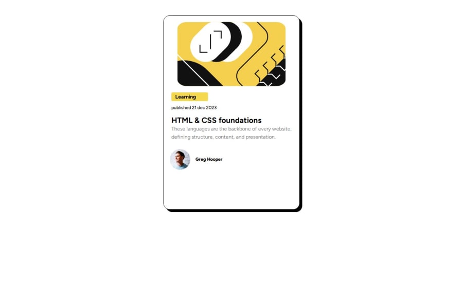
https://github.com/Papi84/blog-preview/blob/main/Blog%20Preview/style.
Design comparison
Solution retrospective
I’m most proud of how I implemented the design and user experience aspects of the project. Next time, I would focus more on optimizing the performance and loading times. Although the project functions well, I realized that certain elements could be streamlined or made more efficient. I would also conduct more thorough user testing to identify and address usability issues earlier in the development process.
What challenges did you encounter, and how did you overcome them?Challenges Encountered:
- faced challenges with slow page load times due to unoptimized images and heavy scripts. To overcome this, I implemented image compression and asynchronous loading for scripts, which significantly improved performance.
2.Cross-Browser Compatibility Ensuring consistent appearance and functionality across different browsers was tricky. I tackled this by using CSS resets and testing extensively on multiple browsers, making adjustments as needed.
- Responsive Design: Achieving a responsive layout that worked well on both mobile and desktop devices required numerous tweaks. I addressed this by using flexible grid systems and media queries to adapt the design to various screen sizes.
How I Overcame Them:
- For Performance Issues: I used tools like Google PageSpeed Insights to identify bottlenecks and applied their recommendations.
- For Cross-Browser Compatibility: I used browser developer tools to debug issues and leveraged browser-specific prefixes and fallbacks.
- For Responsive Design: I employed a mobile-first approach and utilized frameworks like Bootstrap to streamline the responsive design process.
Each challenge provided valuable learning experiences that helped refine my problem-solving skills and improve the overall quality of the project.
What specific areas of your project would you like help with?Well, I still have a long way to go, but I am dedicating my time to overcoming all challenges. I mostly need help with linking HTML to CSS, and I am learning how to address that issue.
Community feedback
Please log in to post a comment
Log in with GitHubJoin our Discord community
Join thousands of Frontend Mentor community members taking the challenges, sharing resources, helping each other, and chatting about all things front-end!
Join our Discord
