Submitted about 3 years ago
https://github.com/nironwp/qr-code-challenge
#webflow
@nironwp
Design comparison
SolutionDesign
Solution retrospective
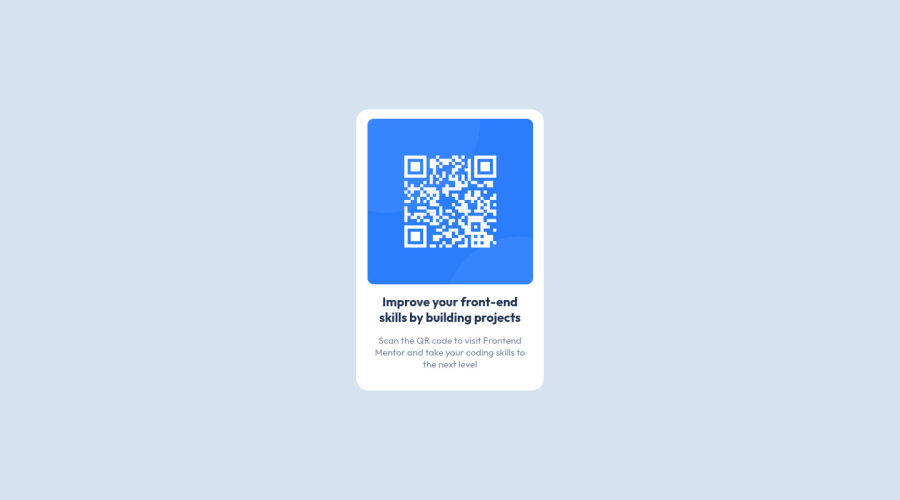
I had difficulty in aligning the h1 and the paragraph, and I think I could have done the image and its resizing in another way, but overall what can I improve?
Community feedback
- @TechNechPosted about 3 years ago
Hi, good works it almost looks similiar to the design. I think you don't need to change any of it.
- You don't have any
.containerproperty setup in CSS, I suggest you set it. - Also on your
qrclass adddisplay: flex;then you can align items to center justjustify-contentandalign-items. - I see in code you have added
scripttag which isn't used, so remove that.
Always try to use semantic HTML5 tags instead of a lot
div, it will keep your code cleaner. The rest is good work!Happy Coding! :)
Marked as helpful0 - You don't have any
Please log in to post a comment
Log in with GitHubJoin our Discord community
Join thousands of Frontend Mentor community members taking the challenges, sharing resources, helping each other, and chatting about all things front-end!
Join our Discord
