Submitted 6 months ago
https://ecommerce-product-page-main-blond.vercel.app/
#accessibility

@nigahiga34

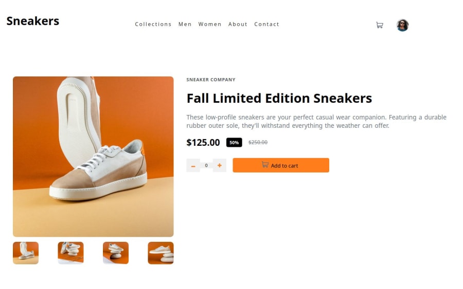
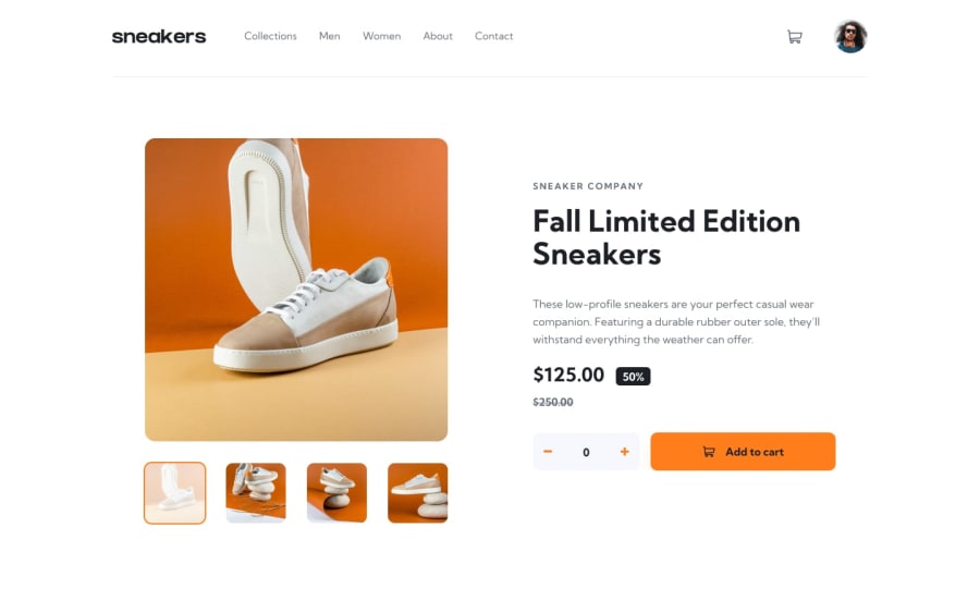
Design comparison
SolutionDesign
Community feedback
Please log in to post a comment
Log in with GitHub
Join our Discord community
Join thousands of Frontend Mentor community members taking the challenges, sharing resources, helping each other, and chatting about all things front-end!
Join our Discord