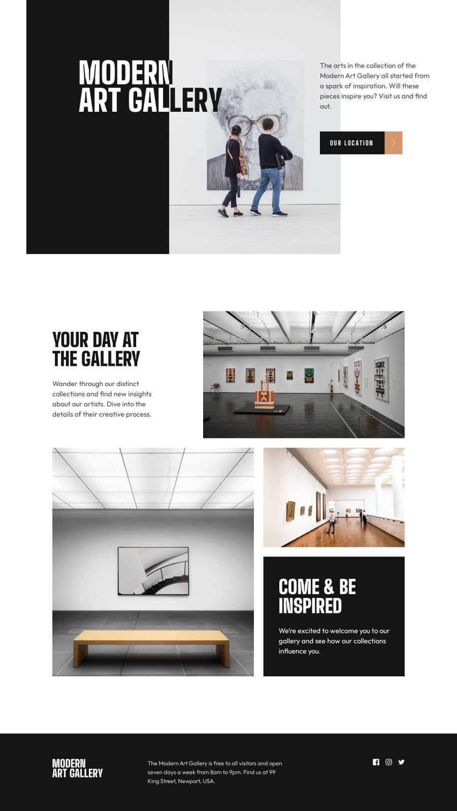
Design comparison
Solution retrospective
I am most proud of creating an illusion for the header title 'Modern Art Gallery'. It took me a while to recreate the design that was given to me. According to the design, some of the letters in 'Modern Art Gallery' had to be white while others needed to be black. I tried many different approaches until I found one approach that worked decently.
In this situation, I can't think of a different way or better way to recreate the design for 'Modern Art Gallery', but if you believe there is a better way, please let me know!
What challenges did you encounter, and how did you overcome them?The biggest challenge that I encountered was creating the design for the 'Modern Art Gallery' title. I used the approach that consisted of two containers(div) with 'position: relative'. One container was a black box, and the other was a container that had an image of an old woman.
Each of these containers had 'overflow: hidden' and the title 'Modern Art Gallery' as an image tag. I used the css properties 'top, left, bottom and right' in a way that gave the illusion that the title 'Modern Art Gallery' moved the way it does in the webpage.
Honestly, this is harder to explain in text, it would be easier to show you if you just saw the webpage.
What specific areas of your project would you like help with?I don't think I needed help, but I'm always open for constructive criticism.
Community feedback
Please log in to post a comment
Log in with GitHubJoin our Discord community
Join thousands of Frontend Mentor community members taking the challenges, sharing resources, helping each other, and chatting about all things front-end!
Join our Discord
