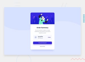
Submitted over 1 year ago
https://64a33a8b1a33a65e79b26d27--splendid-stardust-7882d3.netlify.app
@andresd0319
Design comparison
SolutionDesign
Solution retrospective
I want to keep improving step by step.
Community feedback
- @thomashertogPosted over 1 year ago
your solution looks good visually! some small code improvements can be made though
HTML/accessibility
- you've used a
<section>, however that doesn't add any semantics nor a landmark.<section>is only useful if you can associate it with a header <article>is something that should make sense on it's own page, so definitely not the right element for that plan<a>is for linking to another page, i'm a bit unsure what other page you would navigate to when changing a plan/proceeding, they might be better off as a<button>- you're missing an
<h1>, which is like reading a book without a titleµ - the image on top is meaningful content in my opinion, so it should be in the HTML with a proper
alttext instead of in CSS
CSS
- no particular comment here, though you may want to look into CSS custom properties (or variables as they are often called as well) to have a centralized place to edit those instead of having to edit them all over your code
0 - you've used a
Please log in to post a comment
Log in with GitHubJoin our Discord community
Join thousands of Frontend Mentor community members taking the challenges, sharing resources, helping each other, and chatting about all things front-end!
Join our Discord
