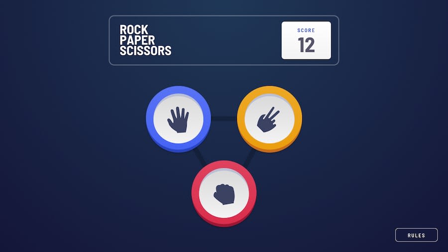
HTMX, Tailwind, Scala SSR, Thymeleaf & Cask, deployed via docker image
Design comparison
Solution retrospective
Submitting before finilazing README with lessons learned, but I'm all to eager to feel completion of at least the task itself.
First step of actually using HTMX - parts of the page are getting updated to the fragments returned by "hx:get" requests. HTMX is the small js library that extends HTML language with interactivity - so that all tags could issude Ajax requests, and responses of these requests could be spliced into the page.
It was hard figuring out more complex things of Thymeleaf templates: fragment is named part of the template which can be rendered separately from the whole .html template file. This way i can have one 'showdown.html' for the view after player chooses the hand, so it's possible to open it as a static file. But then render only part of "showdown-table" to be spliced into 'index.html' instead of "controlls"
Prevoius "frontend only tasks" I hosted on CloudFlare pages, because it was easy to compile ScalaJS into static site and serve the files. Here I'm creating and publishing a Docker image, and hosting on render.com, because it allows gratis hosting from docker images with some limitations. (If the project is not running for 15 minutes it's spunned down, so please wait for the server to start up if you're visiting the page and it takes long to load)
I'm also using inline scripting to save updates score into local storage, and get it on page load.
I'm most unsure about the way to organize fragments, maybe i want less fragments on a single page, so it would be easier to have more fine grained "showdown-only-player.html" and "showdown-player-and-house.html" for different parts of the flow
I'm also quite happy with my idea of using CSS variables for styling of fragments, this way i can have 'style="<staticly available var definitions>"' which would be completely overridded on render time with 'th:style="<values taken from variables>"' But i suppose that these stylings of the fragments are better done not in code (having "8rem" as attribute of the model), but in the outer tags of the pages that include the fragment.
And a huge thing left undone - I didn't look at the desktop design request in the beginning - and my organization of "player hand", "house hand" and "game result message" weren't easily compatible to the desktop design request, so for now desktop design is just scaled up mobile design.
Which is also a huge thing I'll need to learn - if i'm to style the fragments with CSS variables, then controlling their styling with TailwindCSS md: ld: prefixes becomes hard. So another hack - i've just applied "md:transform-150"
Things to do learn in the future: more about organizing fragnemnts and their stlyes
Community feedback
Please log in to post a comment
Log in with GitHubJoin our Discord community
Join thousands of Frontend Mentor community members taking the challenges, sharing resources, helping each other, and chatting about all things front-end!
Join our Discord

