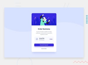
Design comparison
Solution retrospective
Another challenge i really enjoyed this one feedback is welcome.
Community feedback
- @FluffyKasPosted about 3 years ago
Hey,
Your solution looks awesome, and although I'd argue how user-friendly that wiggling effect is, it's certainly fun.^^
I'd perhaps try using a more semantic markup (rather than just using divs) and adding your own README to the project instead of the README Frontend provides for YOU to complete the challenge.
0@tomas938Posted about 3 years ago@FluffyKas thanks you for response i was thinking about more semantic tags i can maybe wrap card to <main> tag or do you have some recommendation ? ;)
0@FluffyKasPosted about 3 years ago@tomas938 I'm reworking my own solution to this challenge so here's what I found:
I saw you changed your card div to
mainso that's good! Since h1-h6 elements are purely semantic, I suppose (as Frontend's accessibility&html report suggests) we should increase them by 1 and if you'd like give them a different look, you could still do it with CSS. I'm not 100% sure about this, as this is just a small component and perhaps in context of a bigger page it would make sense to name the "Annual Plan" part h3. But as the report suggest, I suppose here, it makes more sense to increase just by one.I saw you added you background image as an empty div, so perhaps for this div and for the music icon you could add an
aria-hidden=true, as these elements are purely decorative and probably should be skipped by assistive technology. Or giving images analtI believe is also a good solution.Then again, I'm not an expert on this topic, I just started paying more attention to this myself and read more about it ^^
1
Please log in to post a comment
Log in with GitHubJoin our Discord community
Join thousands of Frontend Mentor community members taking the challenges, sharing resources, helping each other, and chatting about all things front-end!
Join our Discord
