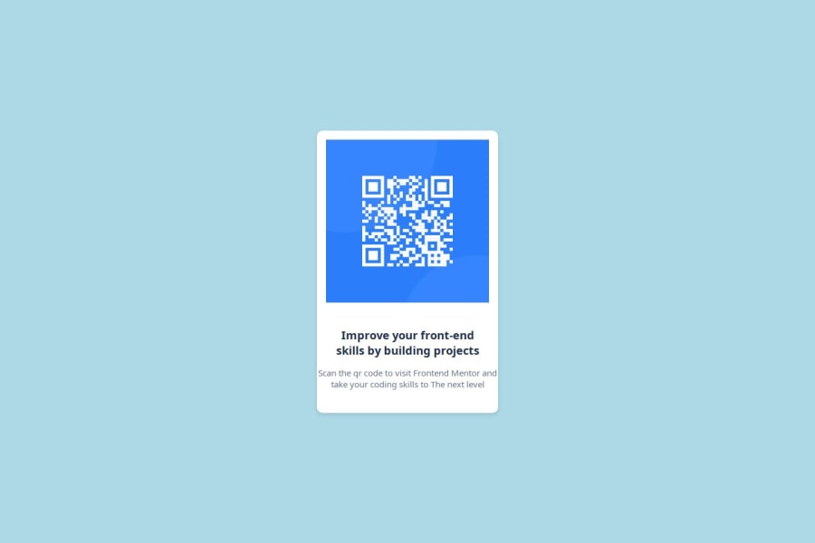
Design comparison
Solution retrospective
I know more about CSS and maybe next time I will try again with a different case study
What challenges did you encounter, and how did you overcome them?I was a little confused at first and looked it up on chatgpt and I started to understand
What specific areas of your project would you like help with?I want to deepen my knowledge in the field of frontend developer
Community feedback
- @JxPV5Posted 7 months ago
It looks quite nice! I'll point out some things I'd do differently
You didn't really need to make the top texts and bottom texts separate, using a <br> in a single <span> element would just do as good.
You didn't really need to make classes and therefore span and div since the website is quite simple.
I've heard using <h1> is not a good practice excluding the most important info on the site.
Only actual problem I have noticed is that if you zoom out the background color is not the same, but still, nice work. If you like what you're doing, do not give up and be eager to improve and new learn skills. You can only become better and better
I'm quite a beginner myself so I'm not sure whether everything I've said so far is valid. I hope the webdev journey will be good and enjoyable for you!
0
Please log in to post a comment
Log in with GitHubJoin our Discord community
Join thousands of Frontend Mentor community members taking the challenges, sharing resources, helping each other, and chatting about all things front-end!
Join our Discord
