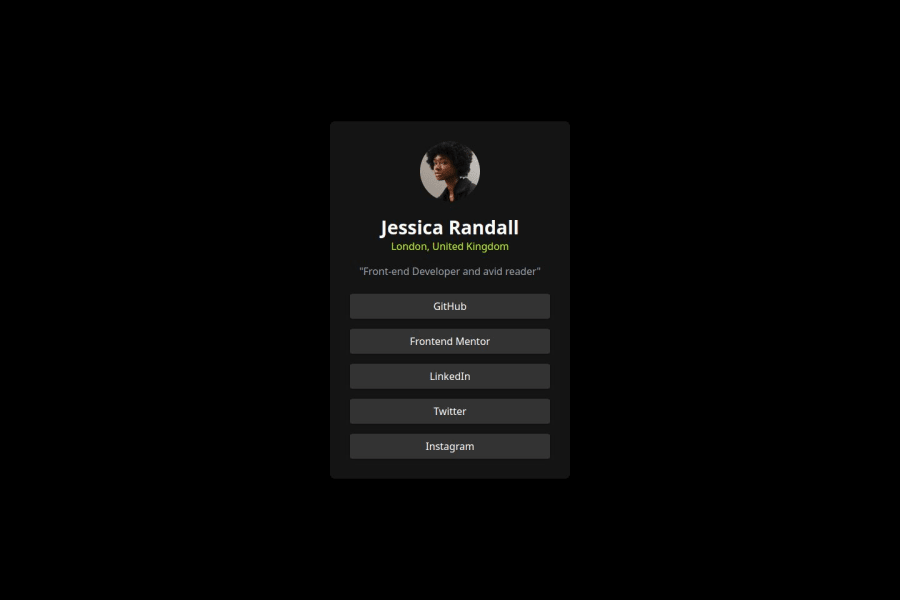
Design comparison
Solution retrospective
i will deepen my knowledge in the frontend field
What challenges did you encounter, and how did you overcome them?The design form is difficult because in this project I can't see the detailed design of the figure
What specific areas of your project would you like help with?maybe from a frontend perspective, even though I'm not a professional yet
Community feedback
- P@lynx232Posted 6 months ago
"Does the solution include semantic HTML?" No. Next time instead of <div> elements which have no meaning to screen readers go by modern standards and use elements such as <main> for the card itself, <p> for the paragraphs, <nav>, <button> for the the links etc. Also, within a <footer> element add the "challenge by Frontend mentor"... contained in index.html found in the zip file provided.
"Is it accessible, and what improvements could be made?" Make use of a <link> element that links to a css file. Also, implement your styling in the css file. The html file should be used only for structuring the page, meanwhile the css file should be used for styling. Think of the html file as containing the foundation of a house, it's walls, it's support pillars etc., while the css file contains the type of paint used, the floor's material, the roof's color etc.
"Does the layout look good on a range of screen sizes?" No. In a css file you should use different techniques such as setting the font size to an em unit(the em unit is equivalent to whatever size is set by default on the used browser), using a width for the container of 100%(so that it will resize according to the browser), media queries so you can set some different rules depending on the screen size etc. It's also a good idea to implement some variables in order to avoid repetition and to keep everything more organized.
"Is the code well-structured, readable, and reusable?". See question #1.
"Does the solution differ considerably from the design?" It does. Next time use the font found in the style guide. Import it in the css file. And try to use the colors provided. Also the links don't change color as they are hovered over, so use functions in css next time.
It is a great thing that you embarked on this journey, you will find that even though it requires hard work and patience it can be very rewarding. I suggest that you continue on this path, but my advice is to focus more on studying in order to become more skillful at this, be it by reading the documentation of css, html, watching youtube coursers of simply google-ing whenever necessary.
Also, I recommend the following sites for honing your skills: "https://flexboxfroggy.com/" - a game for teaching you about css flexboxes; "https://cssgridgarden.com/"- a game for teaching you about css grids; "https://validator.w3.org/" - a platform for checking if your html file is up to modern standards; "https://jigsaw.w3.org/css-validator/" - a platform for checking if your css file is up to modern standards.
Best of luck on your journey!
Marked as helpful0@rafirachmawanPosted 6 months ago@lynx232 Thank you very much for your input. I will be better in the next project and will be more careful in working on the project.
0 - @nikxePosted 6 months ago
nice
Marked as helpful0
Please log in to post a comment
Log in with GitHubJoin our Discord community
Join thousands of Frontend Mentor community members taking the challenges, sharing resources, helping each other, and chatting about all things front-end!
Join our Discord
