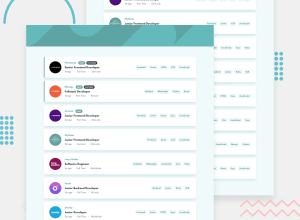
Design comparison
SolutionDesign
Community feedback
- @vovka8101Posted 9 months ago
Wow, looks great! The only thing I would add here is a padding to container div element, because now it attaches to the edges on a mobile screen size...
Marked as helpful0
Please log in to post a comment
Log in with GitHubJoin our Discord community
Join thousands of Frontend Mentor community members taking the challenges, sharing resources, helping each other, and chatting about all things front-end!
Join our Discord
