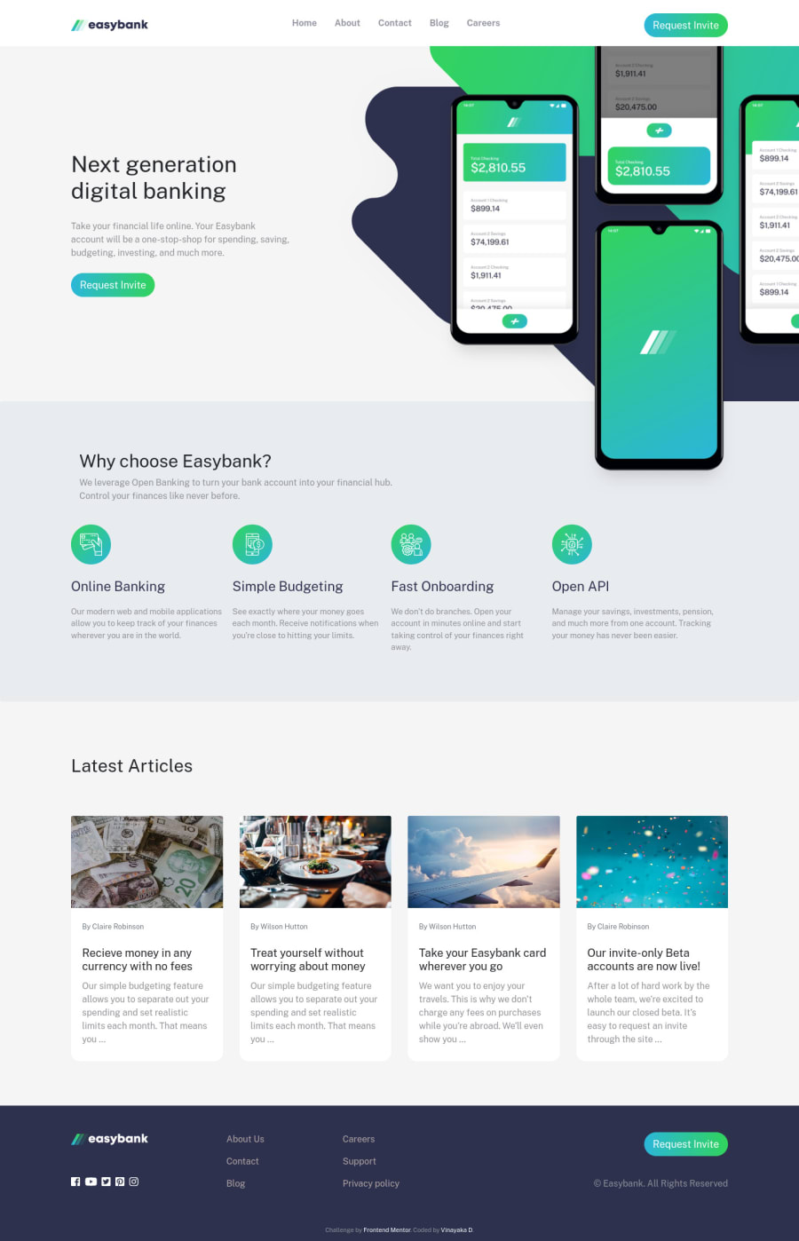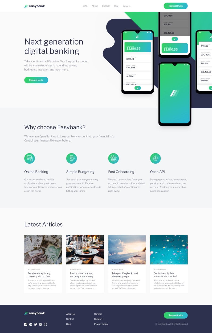
Design comparison
Solution retrospective
Any kind of feedback is welcome.
Community feedback
- @palgrammingPosted over 3 years ago
I have not built this challenge yet so I do not know all the ins and outs to it but it looks like you did everything that is probably intended
The only thing I see is at 769px wide look at how the button in the header has really changed shape . I am thinking you should just make your mobile menu happen maybe around 910px and now when you have the mobile menu coming in now at 768px wide the logo and the hamburger menu are both right up against the edge of the screen with no margin on either of them then later they transition and have margin as the page grows smaller so you might want to tweak that also
0@vd-37Posted over 3 years ago@palgramming Hey, I sorted out those errors that you pointed out. Thanks for taking some time and reviewing the website. Also , looked at your profile , great work!
0
Please log in to post a comment
Log in with GitHubJoin our Discord community
Join thousands of Frontend Mentor community members taking the challenges, sharing resources, helping each other, and chatting about all things front-end!
Join our Discord
