

Design comparison

Solution retrospective
If you have any tips or observations, I'm all hearing :)
Community feedback
- P@palgrammingPosted over 3 years ago
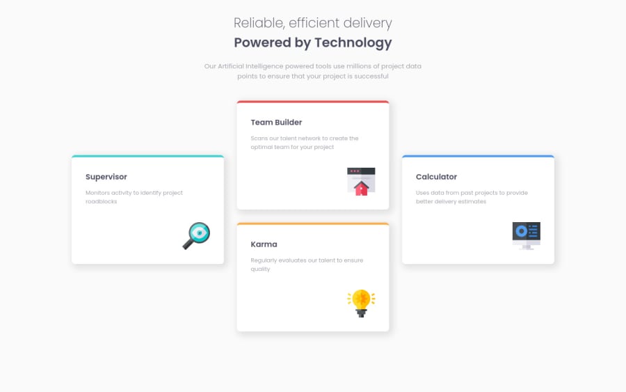
You should look at laying our your cards using Grid Template Areas this makes it easy to transition between the one column mobile layout and the 3 column desktop one it also allows a good mid transition of 2 columns with 2 cards each to make better use of the space in the browser for the mid sized screens
Marked as helpful0@thbdmttPosted over 3 years ago@palgramming After a little night ^^ I just had to delete the main width, and change the font size of my paragraph to get closer to the original design. What you think ?
0 - P@joelsalmeidaPosted over 3 years ago
Hello Thibaud. I have a tip.
Try forming three columns by adding the two middle boxes inside another element "e.g. a flexbox div". Then just adjust the spacing.
It's a simple way to get closer to the original design... without changing too much what you've built.
Hope this helps. Keep coding!
Marked as helpful0@thbdmttPosted over 3 years ago@joelsalmeida Hey Joel ! I just deleted the main width, and change the font size of my paragraph to get closer to the original design. What you think ?
0


Please log in to post a comment
Log in with GitHub
Join our Discord community
Join thousands of Frontend Mentor community members taking the challenges, sharing resources, helping each other, and chatting about all things front-end!
Join our Discord