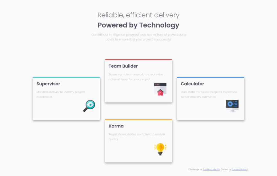
Design comparison
Solution retrospective
I have found some mistakes in old solution, So I remade my code and uploaded it again. I dont know how to delete the old one
Community feedback
- @SzymonRojekPosted almost 4 years ago
Hi Tamarchika,
Well done! :D
I have checked your HTML structure generally and project by the inspector in my browser, a few tips for you:
- I'd recommend reading more about semantic tags (why they matter);
- the bunch of text at the top we can put inside of the header (sometimes people have used the tag aside).
- it is not a good practice to create the text by using div => I'd recommend using paragraphs, headings, span (depends on the situation);
- header: here you can put two texts together as a h1 tag, for example:
<h1 class="heading-primary"> <span class="heading-primary-main">....</span> <span class="heading-primary-sub">....</span> </h1> => and below paragraph
- you did well with the h2 but below please remove the span and instead of it you can place the p tag;
- another important fact: text alt => don't need to use words like picture or image, photo, icons in the alt text as it's already announced as being an image. Also, it is good to ask what kind of role img does have, for example: if we have decorative img - in these cases, a null (empty) alt text should be provided (alt="") so that they can be ignored by assistive technologies, such as screen readers - and here icons are only as decorative images (they do not have a special role here);
- names of the classes could be more readable;
CSS:
- before you write the code it is good to reset the CSS styles, for example:
* { margin: 0; padding: 0; box-sizing: border-box; }
- please check two things when you are learning flexBox (height and width - try to play with it with simple examples).
RWD:
- a project looks really nice on desktop version. If you want to display it well on different devices (mobiles and tablets) I can recommend two courses providing by Wes Bos, they are for free:
- flexBox;
- grid.
Greetings :D
1@TamarchikaPosted almost 4 years ago@SzymonRojek thank u very much. Its really helpful for me, such advices from you. I ll try not to make such mistakes again, I ll foresee ur tips.
1@SzymonRojekPosted almost 4 years ago@Tamarchika
Don't worry. I wouldn't call it as a mistakes => believe me, that's not mistakes. We learn difficult things - mostly they are very tricky and not easy to decide clearly what to do with them. Just keep going! :D
If you want to learn flexbox I have such a nice game with frogs
There is option to change a language, check it out and let me know did you like it! :D
Also, this one: A Complete Guide to Flexbox.
Have a nice coding :D
Ps. Don't forget to upvote any comments on here that you find helpful. **
0
Please log in to post a comment
Log in with GitHubJoin our Discord community
Join thousands of Frontend Mentor community members taking the challenges, sharing resources, helping each other, and chatting about all things front-end!
Join our Discord