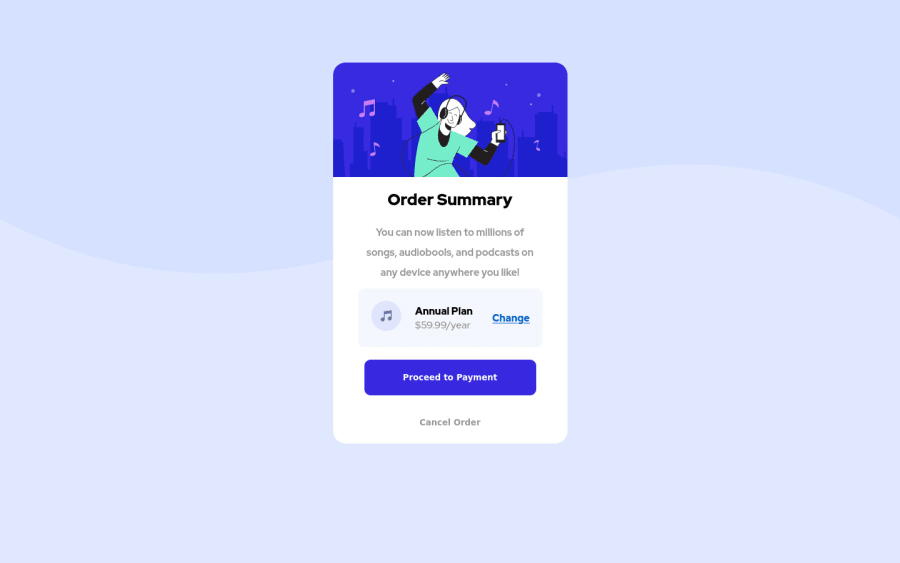
Design comparison
Solution retrospective
Hey everyone! Just starting, hope that's vital =D
Community feedback
- @mickygingerPosted about 3 years ago
This is really well done Artem! 🎉
You could improve things a little by using some semantic HTML tags. For example you have
<div class="header">and<div class="article">where you could (or should) use<header>and<article>respectively.Here's a good article about semantic HTML for you to have a look at: https://www.freecodecamp.org/news/semantic-html5-elements/
Another thing I noticed is that your code is poorly formatted, so the opening and closing tags don't line up and there's lots of whitespace that should be removed. This makes it more difficult to read through and review your code.
I would advise you use a code formatter that will automatically format your code for you, so you don't have to worry about it! Prettier is my favourite. Most code editors like VSCode and Sublime Text come with Prettier plugins.
Hope that helps!
Marked as helpful1@ArtemVMVPosted about 3 years ago@mickyginger Thanks a lot for cheers up and good advices! Thats realy motivate to go further!
0 - @efs0-cod3Posted about 3 years ago
Good solution Artem. I would remove the line-height and font-weight on .article for more aesthetics.
good luck!
0
Please log in to post a comment
Log in with GitHubJoin our Discord community
Join thousands of Frontend Mentor community members taking the challenges, sharing resources, helping each other, and chatting about all things front-end!
Join our Discord
