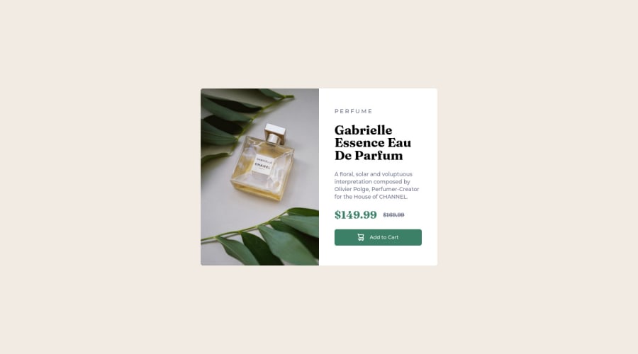
Design comparison
Solution retrospective
Hello! I ended up with a convincing result (in my opinion :D ). The most difficult part for me was the organization of my code, this is really the point I would like to improve: -Is my html well structured? -Is my CSS correct? (I think the reset too big for a project like this)
If you have any ideas for improvement in terms of integration (fonts for example), I'm listening!
Community feedback
- @nelsonuprety1Posted about 2 years ago
Looks good. Can you please mention why did you make a counter.js file?
In my opinion, using !important is not a really good approach, using other alternatives might be a good approach. If you have time please take a look at my code and please provide me feedback on the solution.Thank You. Happy Coding Cheers
0@Loic2APosted about 2 years ago@nelsonuprety1 Woops, all js files are from Vite tool, I used that for the first time and forgot to clear my code after I created my project
Yes, I'm agree with the !important, I confess that I don't understand why the font didn't want to apply without. Probably my css organization is not the best.
Thanks for your review !
1@nelsonuprety1Posted about 2 years ago@Loic2A I have proposed a fix to your problem for the font without using !important. Please check your GitHub repo and if you find it useful please merge the changes.
Cheers
0
Please log in to post a comment
Log in with GitHubJoin our Discord community
Join thousands of Frontend Mentor community members taking the challenges, sharing resources, helping each other, and chatting about all things front-end!
Join our Discord
