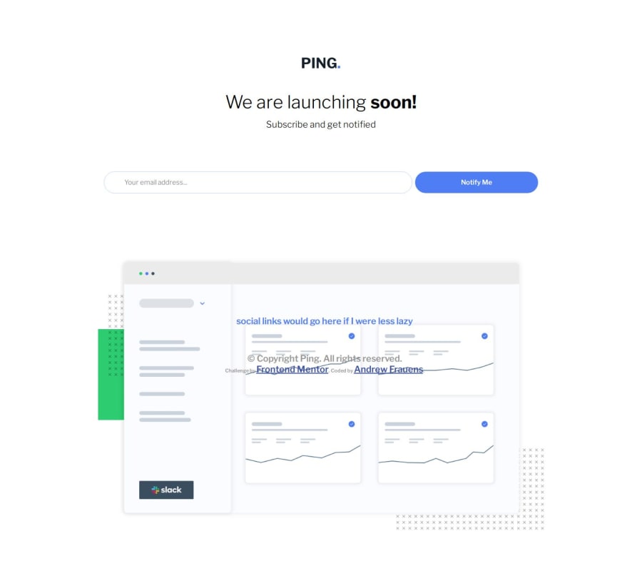
Design comparison
Solution retrospective
I did everything with HTML/CSS, so I'm happy with that. It does mean however I didn't have a great way to match the way errors were being reported in the spec.
What challenges did you encounter, and how did you overcome them?I found getting the email address/notify me buttons to wrap correctly challenging
What specific areas of your project would you like help with?If there's a better way to keep the design responsive with fewer media calls I'd love to hear it. It seems like it should be possible for none to be required with the right min/max width settings.
Community feedback
- @AndrooFrownsPosted 5 months ago
oh no! the footer didn't look like that when I was testing things. oopsy.
0
Please log in to post a comment
Log in with GitHubJoin our Discord community
Join thousands of Frontend Mentor community members taking the challenges, sharing resources, helping each other, and chatting about all things front-end!
Join our Discord
